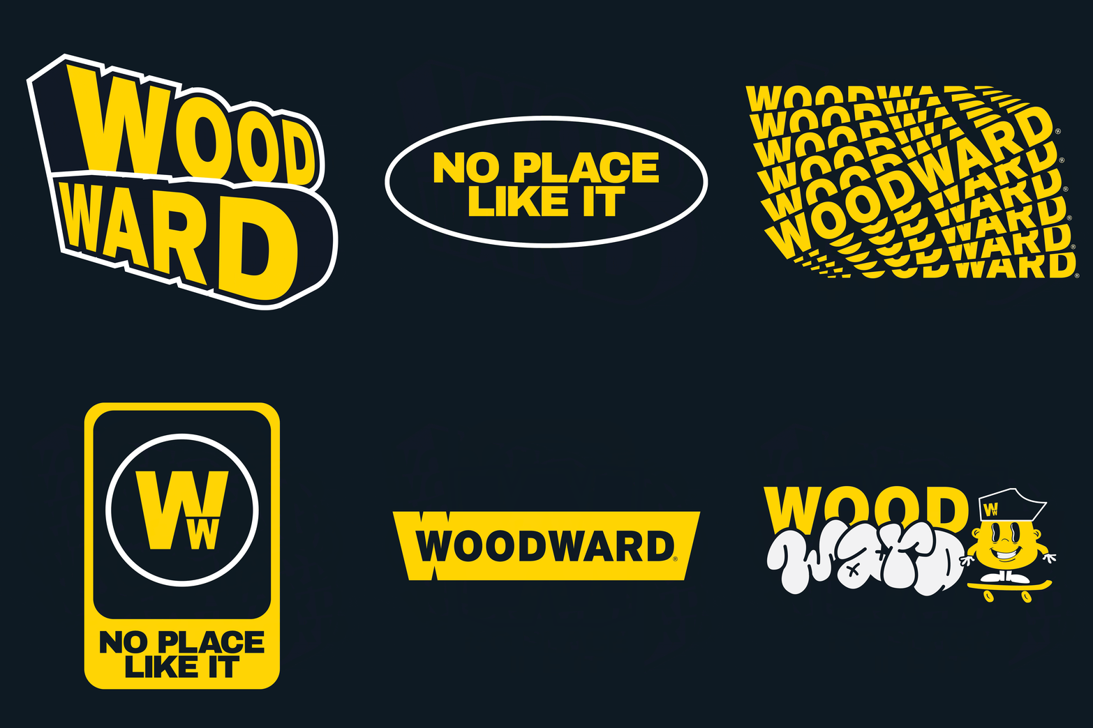
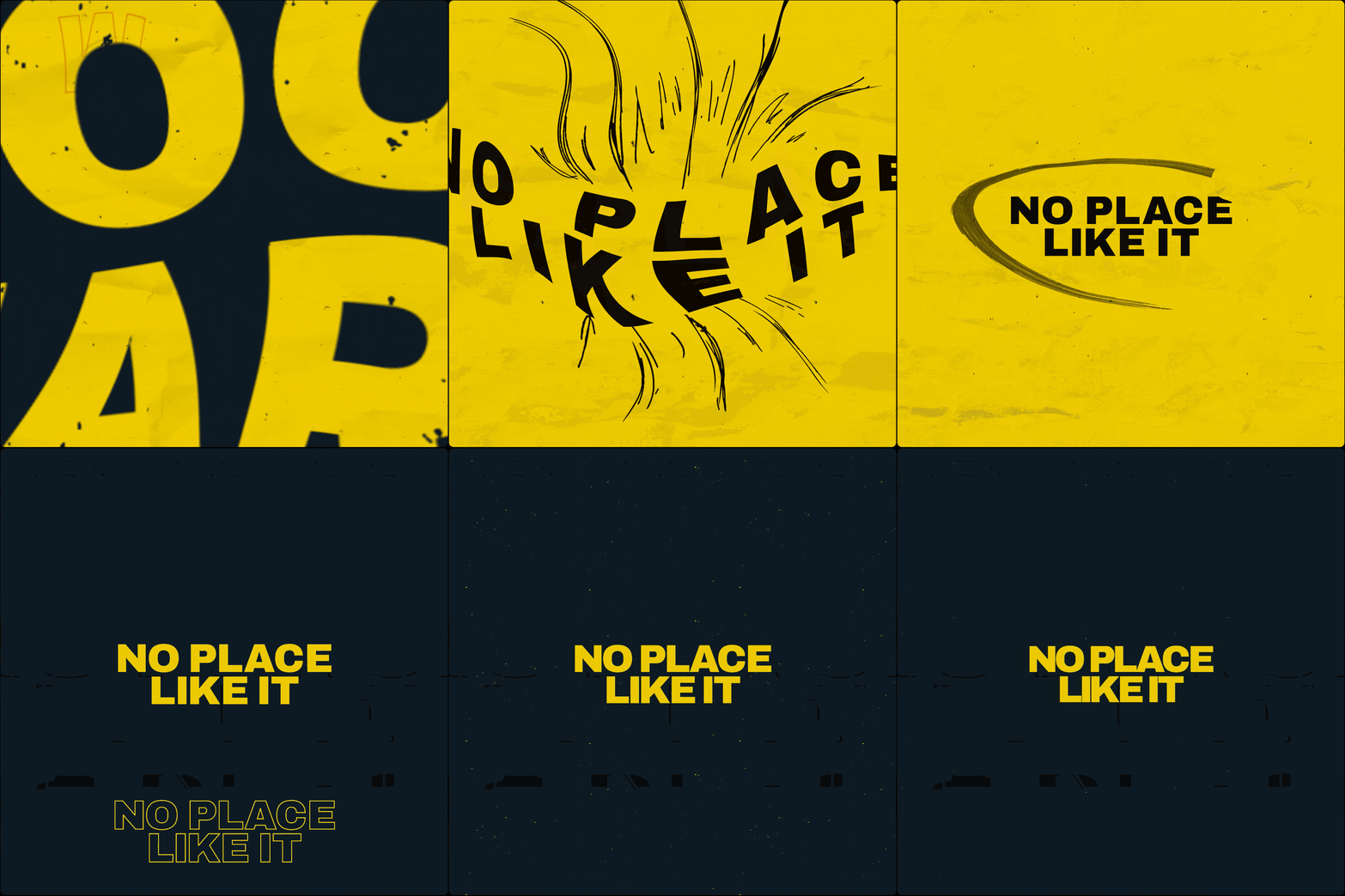


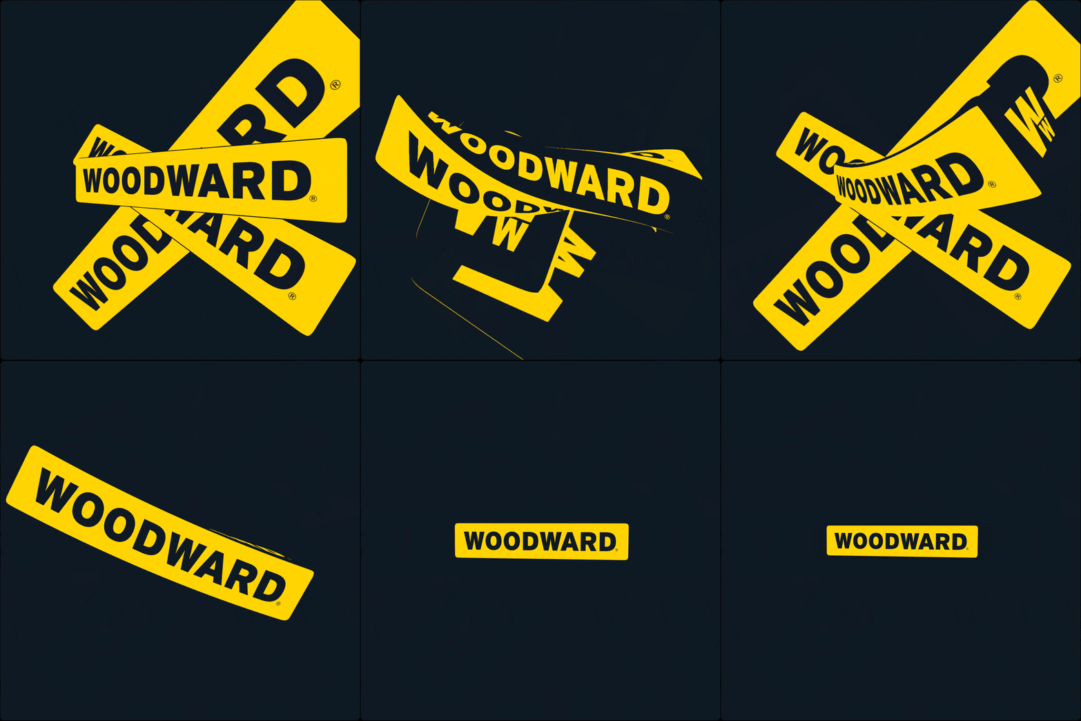
Early logo explorations, graphic elements, and pictorial lockups developed during the initial creative phase,
aimed to capture the energy, progression, and legacy of the brand.
aimed to capture the energy, progression, and legacy of the brand.
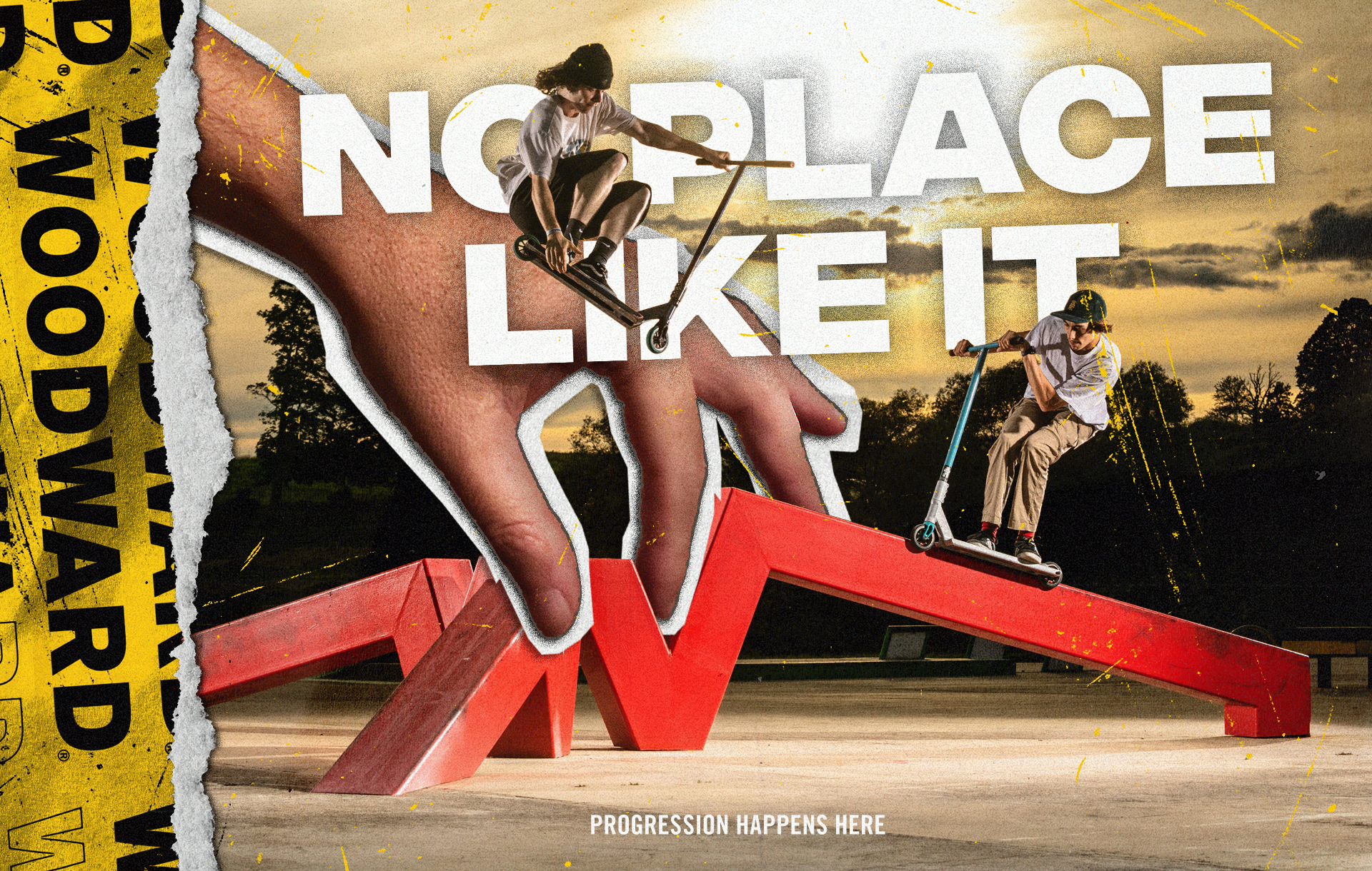
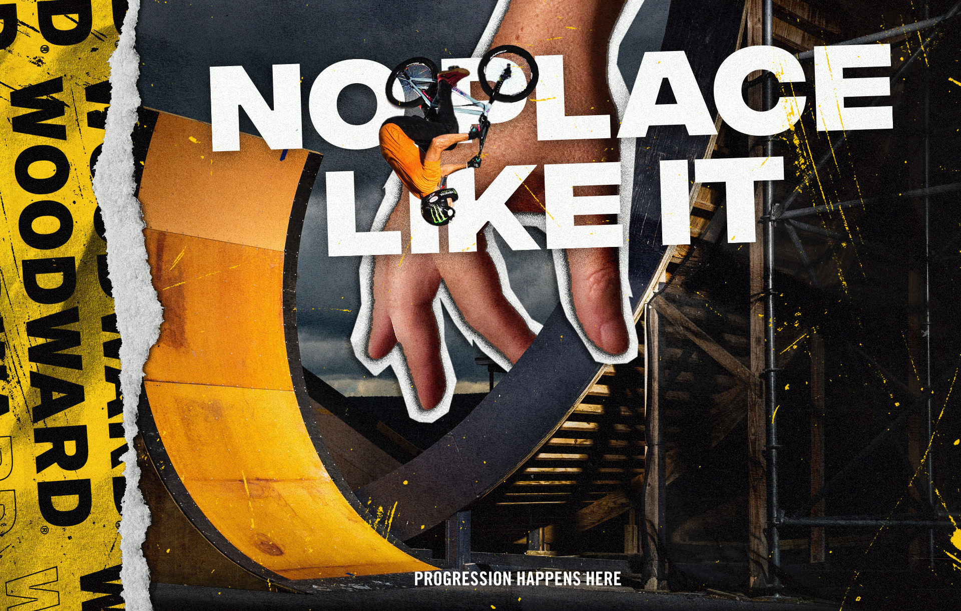
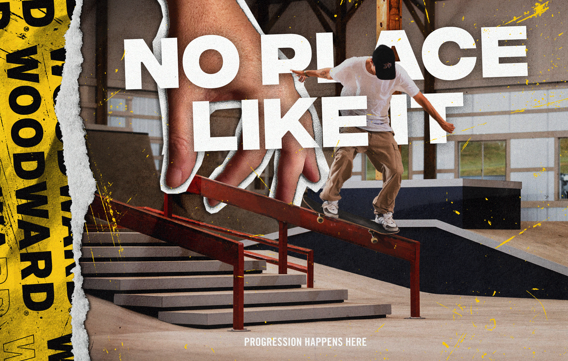
Art direction explorations centered on the campaign’s aspirational side, aiming to inspire and attract riders of all levels to Woodward destinations. The “hand from above” serves as a visual metaphor for Woodward’s guidance and
its one-of-a-kind obstacle offerings.
its one-of-a-kind obstacle offerings.
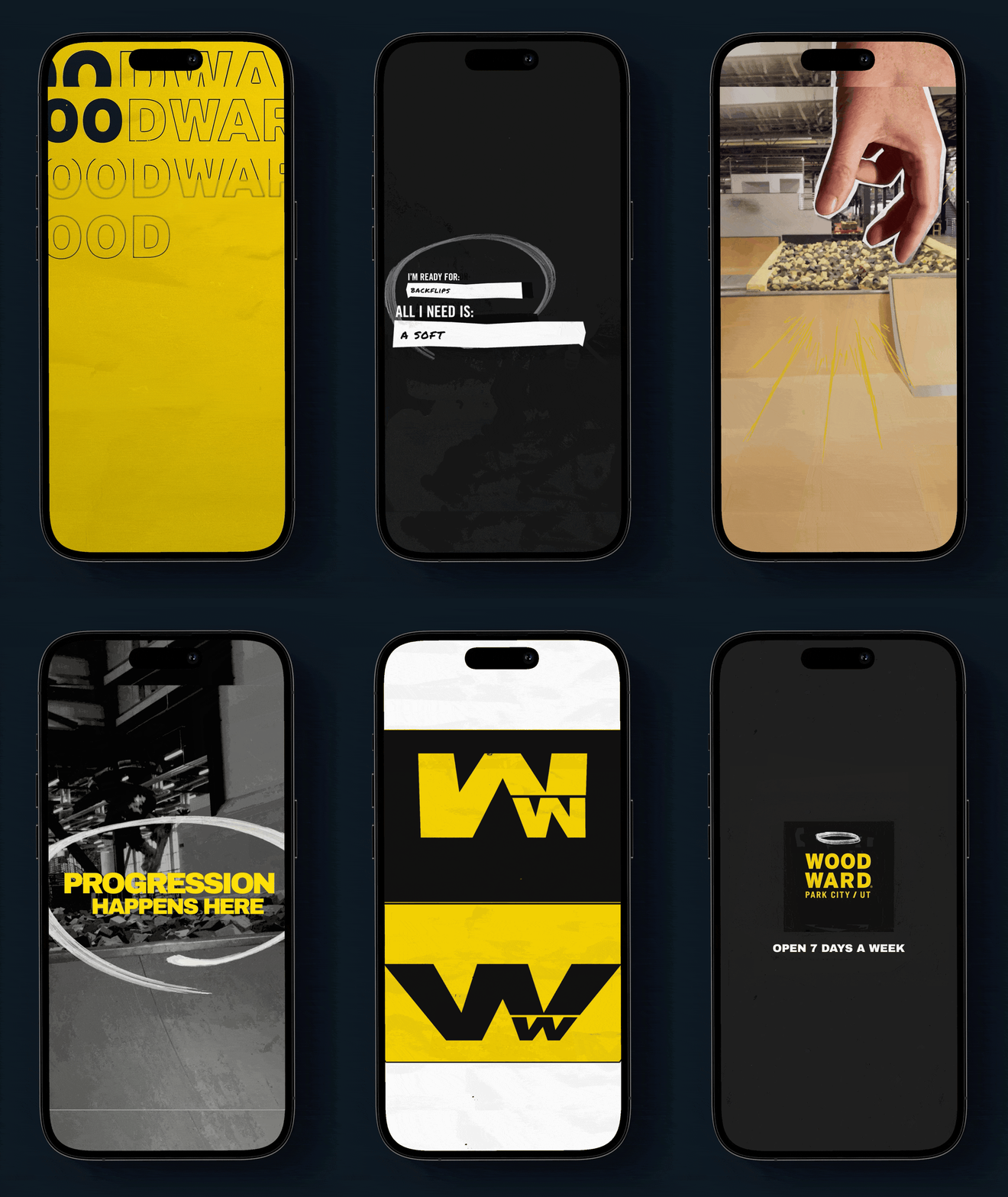
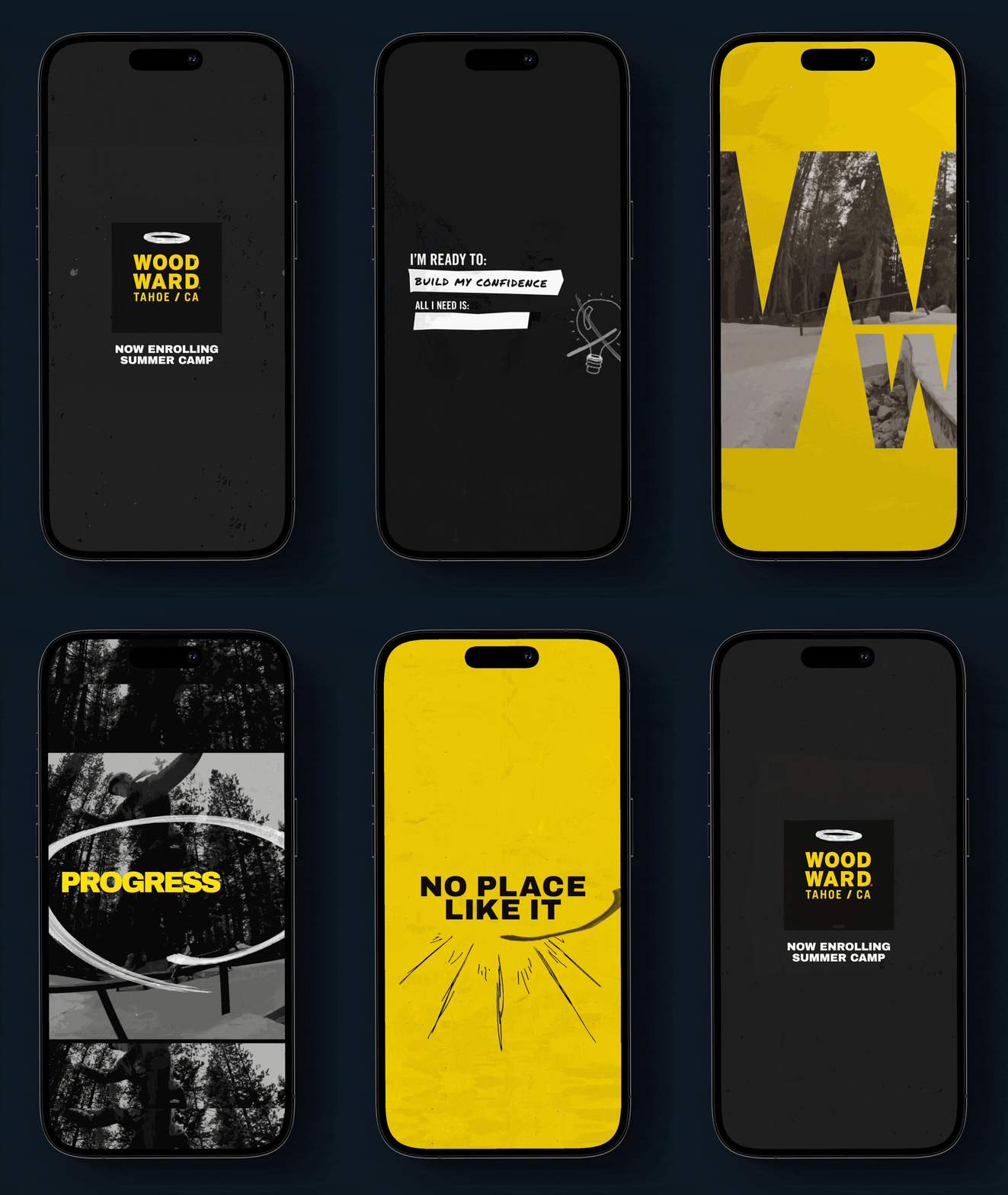
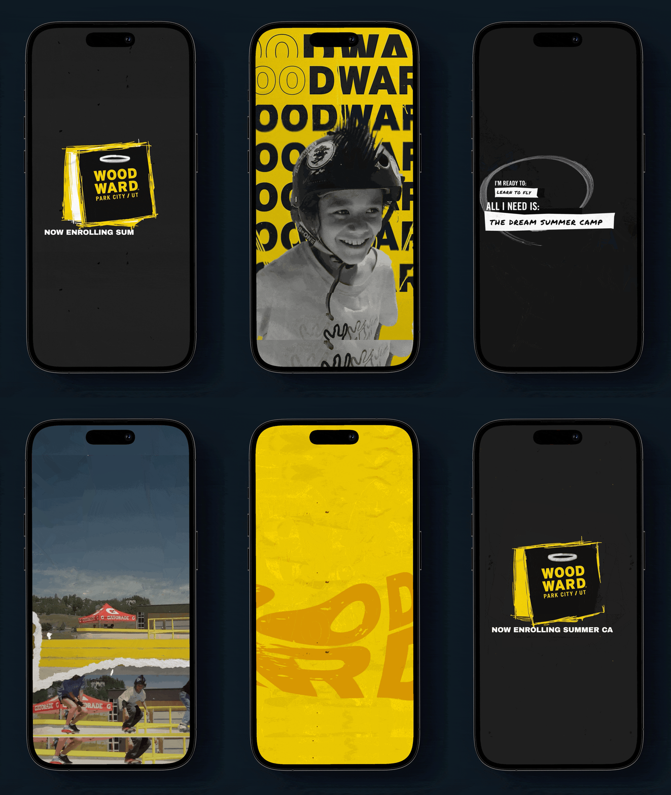
Social campaigns outlining the obstacle progression, based on specific challenges by park visitors, for different levels ranging from beginners using foam-pits, intermediate steps to advanced down rails across all the different Woodward locations.
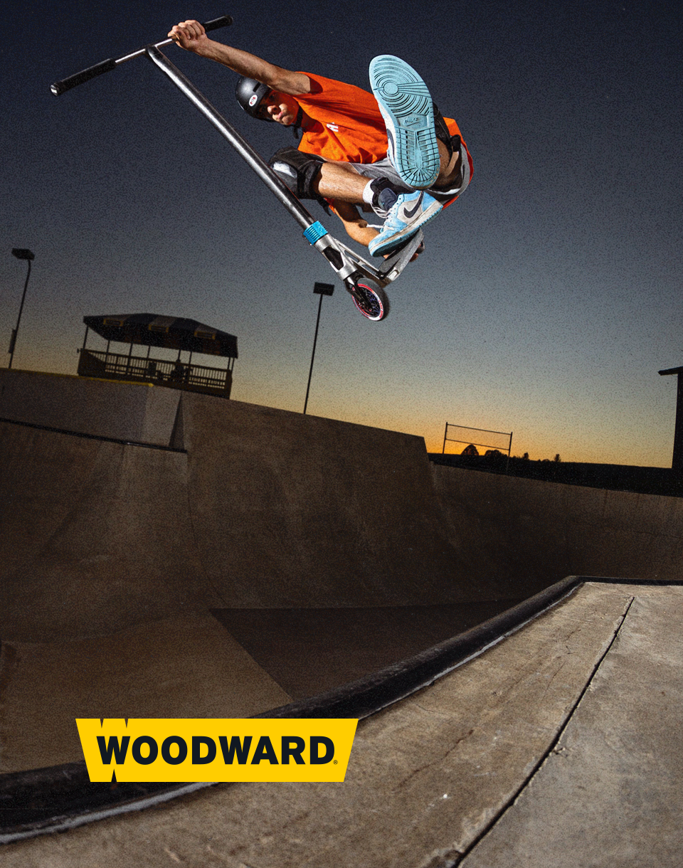
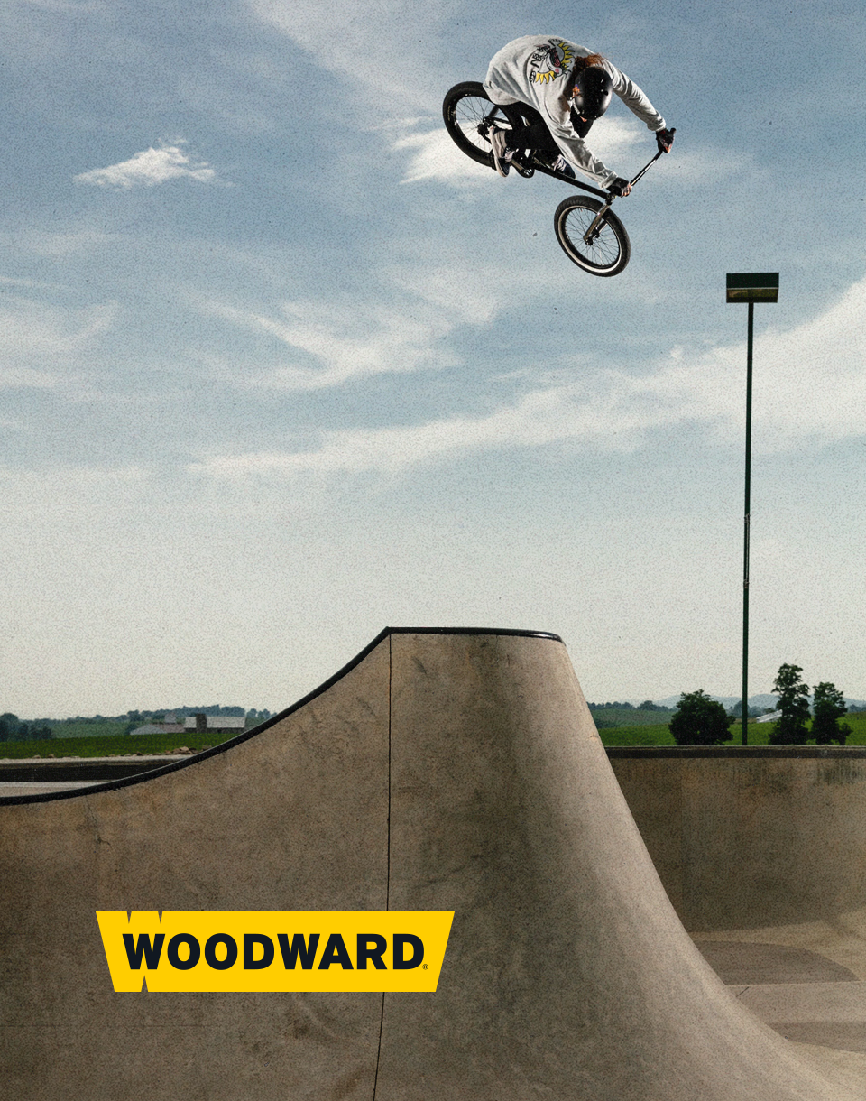
TV Spot aimed to both, aspiring campers and their parents, showcasing the unforgettable Woodward summer camp experience—where athletes can progress safely, build lasting friendships, and push their limits in a world-class environment.
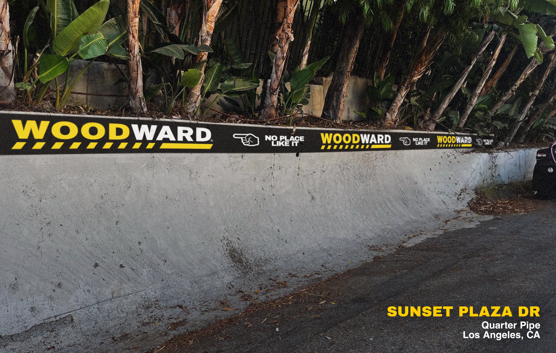
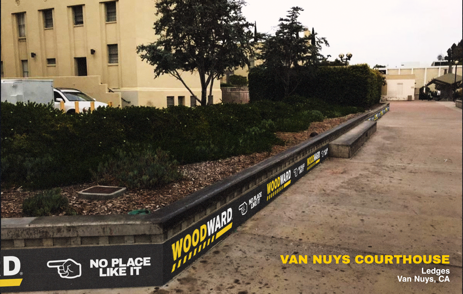
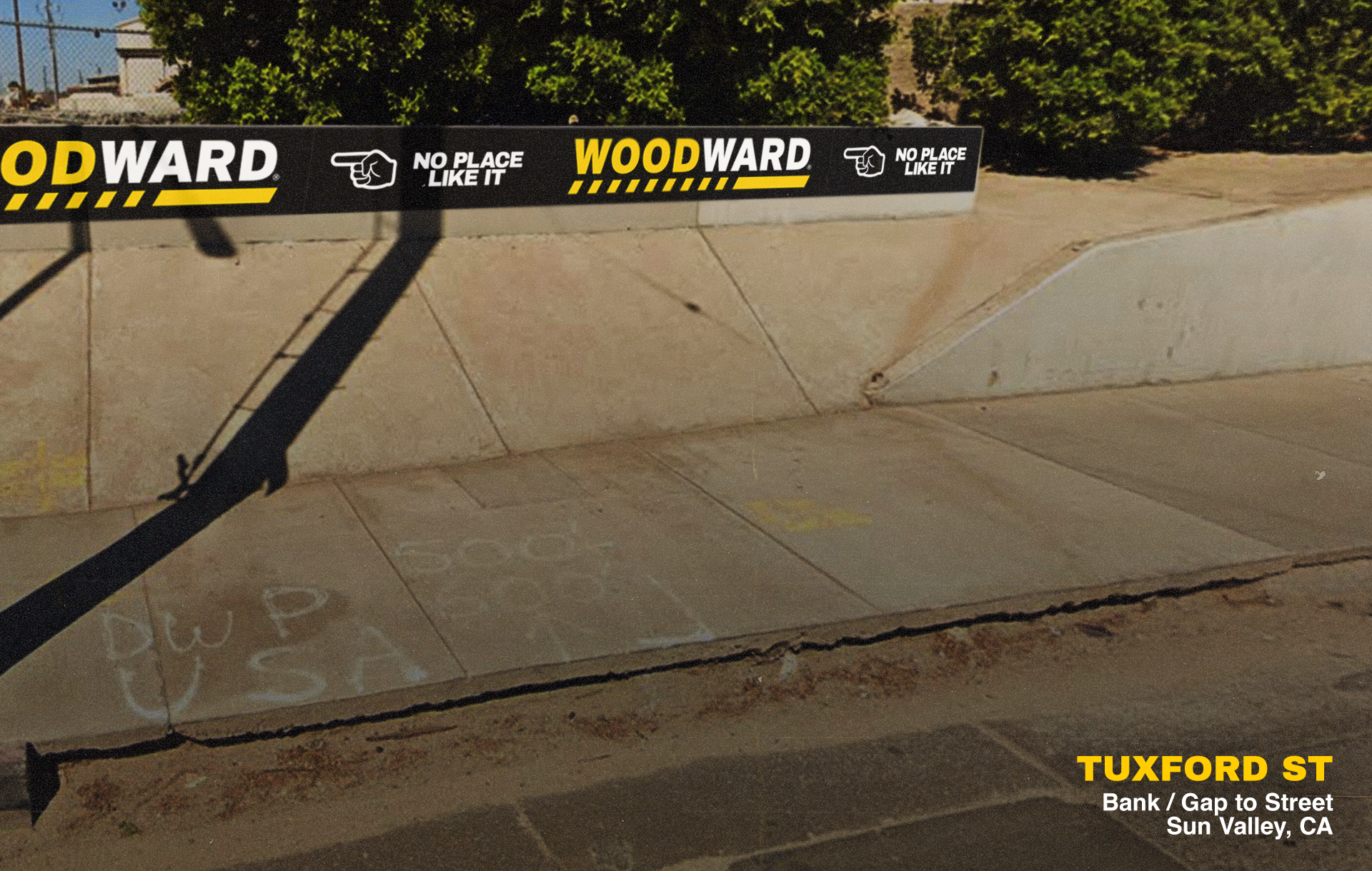
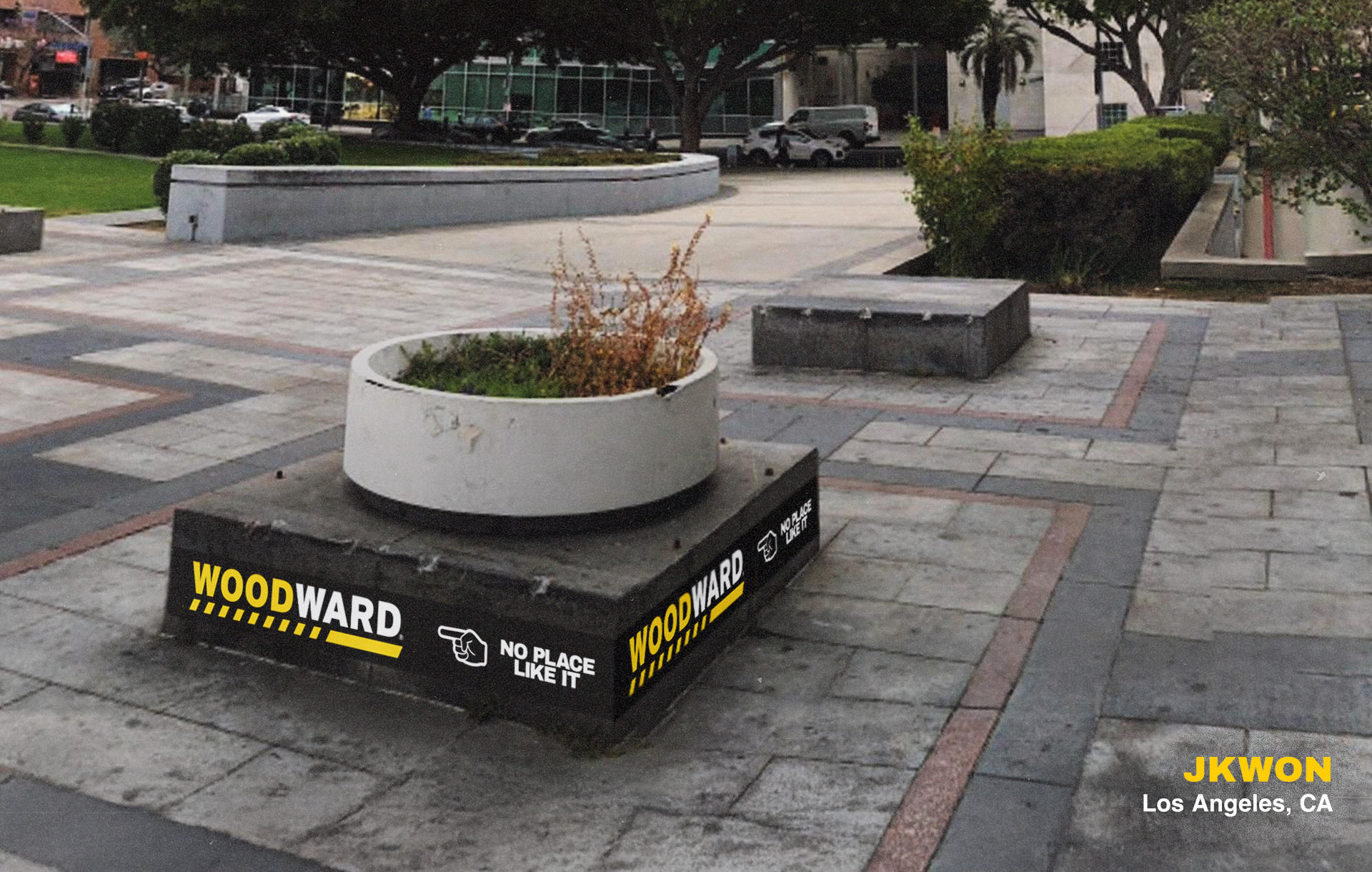
This OOH campaign concept was developed during the creative exploration phase but was not officially presented to the client. While it did not move forward internally, I believe it is a strong and culturally resonant idea worth showcasing on my portfolio
as an example of brand-led, community-driven marketing.
as an example of brand-led, community-driven marketing.
This project was developed while working in-house at Alfa, Denver
