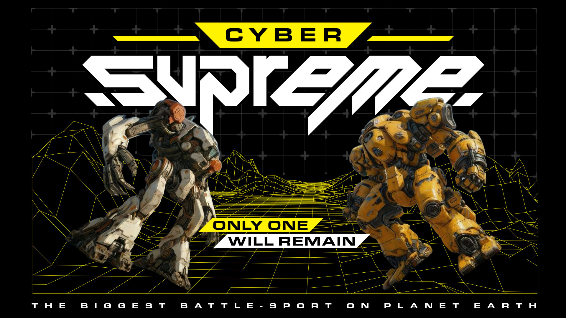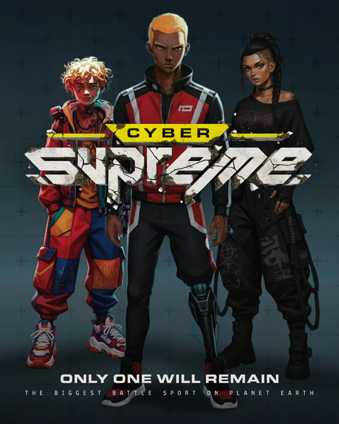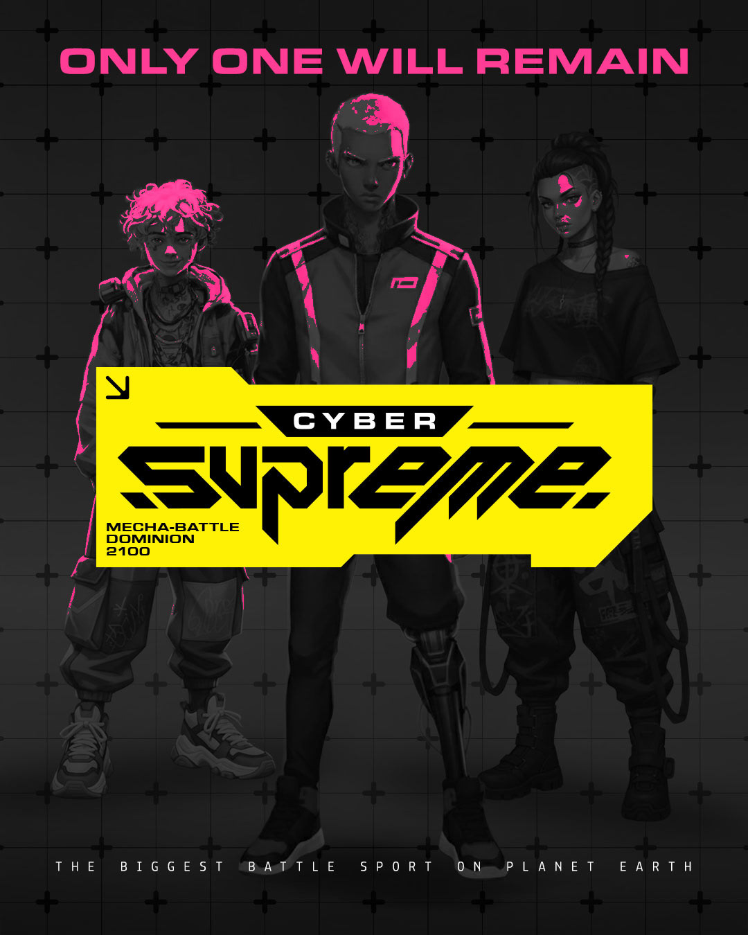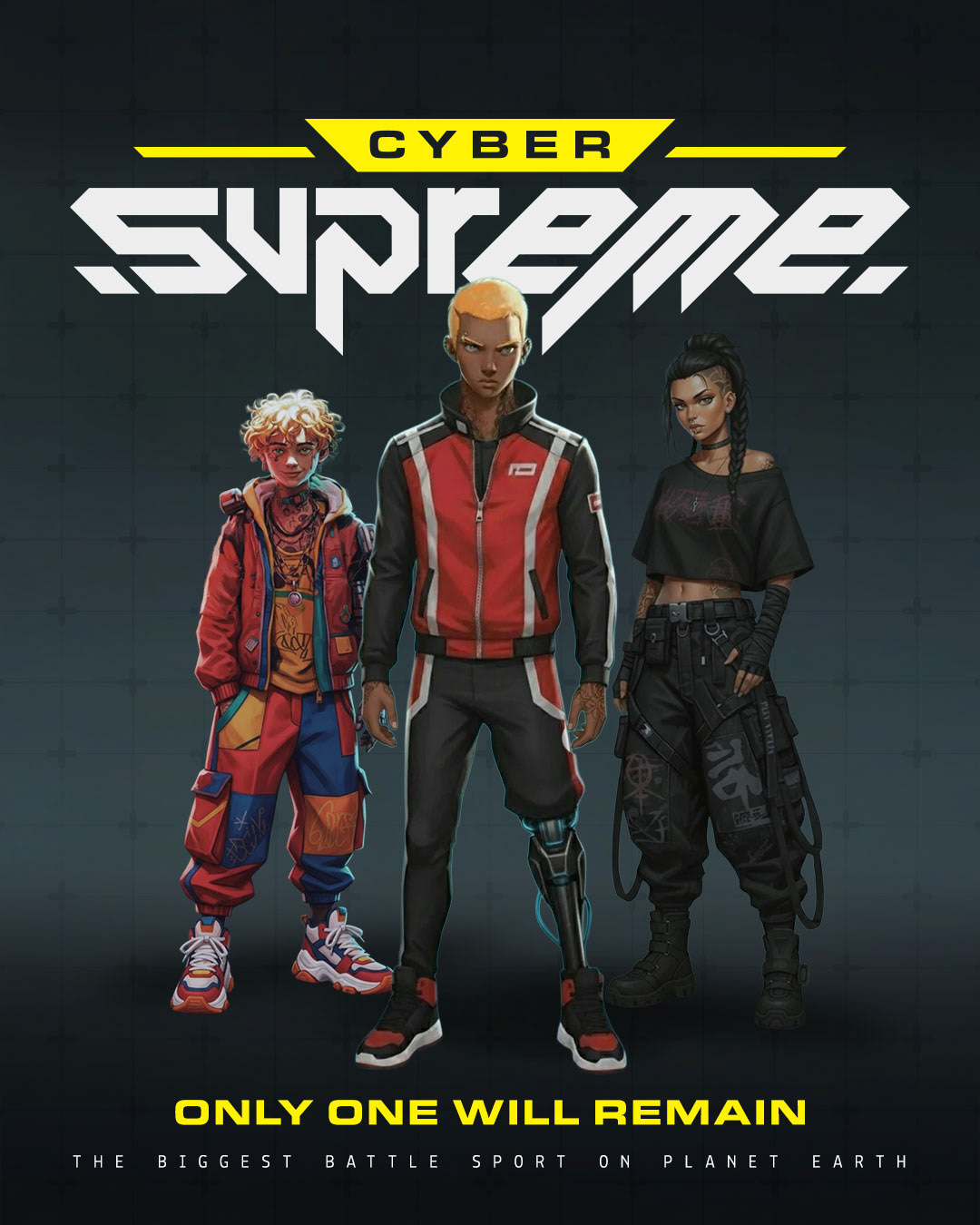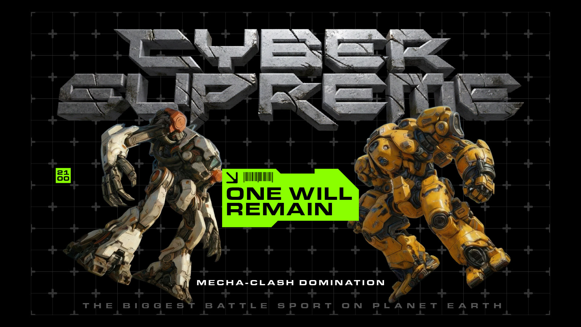

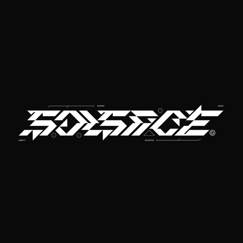
about the biggest sport on the planet in the year 2100, featuring giant mecha beasts that smash each other until the winner remains.
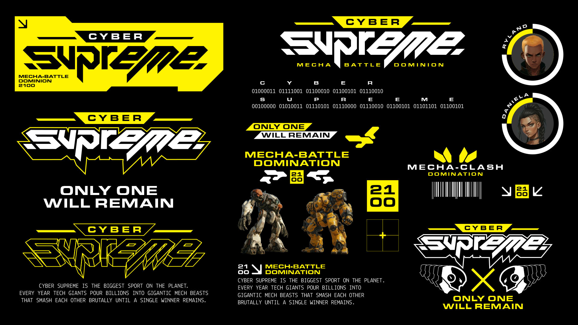
• Angled Shapes
• Denotes Power
• Arched in Form
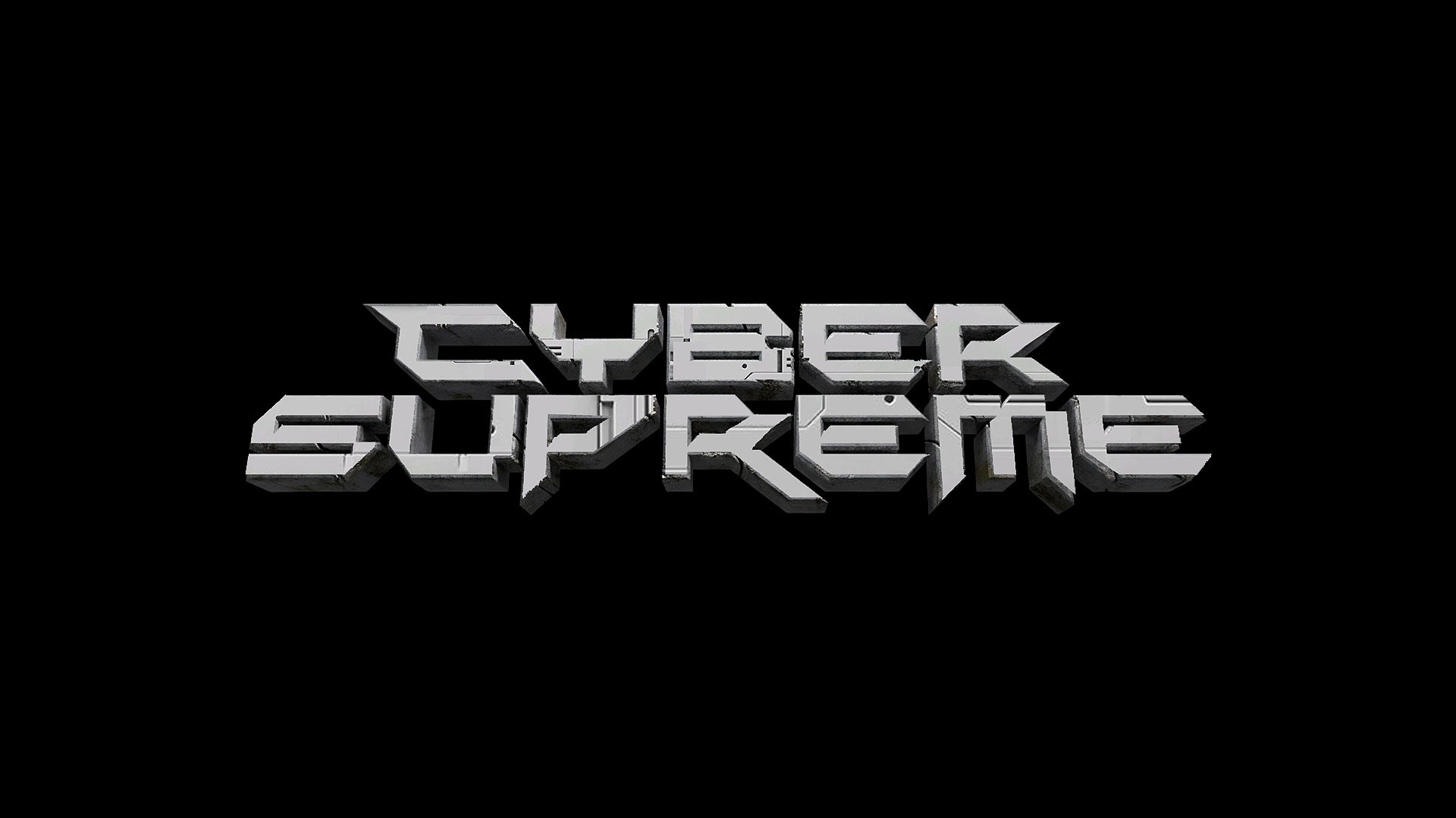
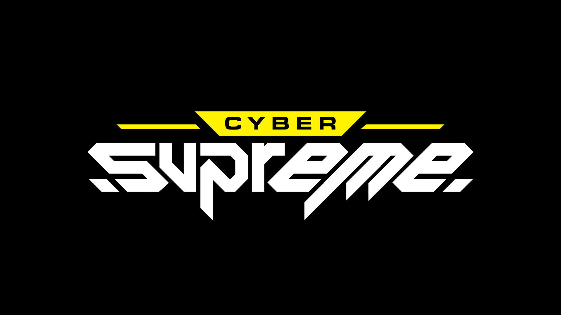
• Cyber in small, Supreme Large


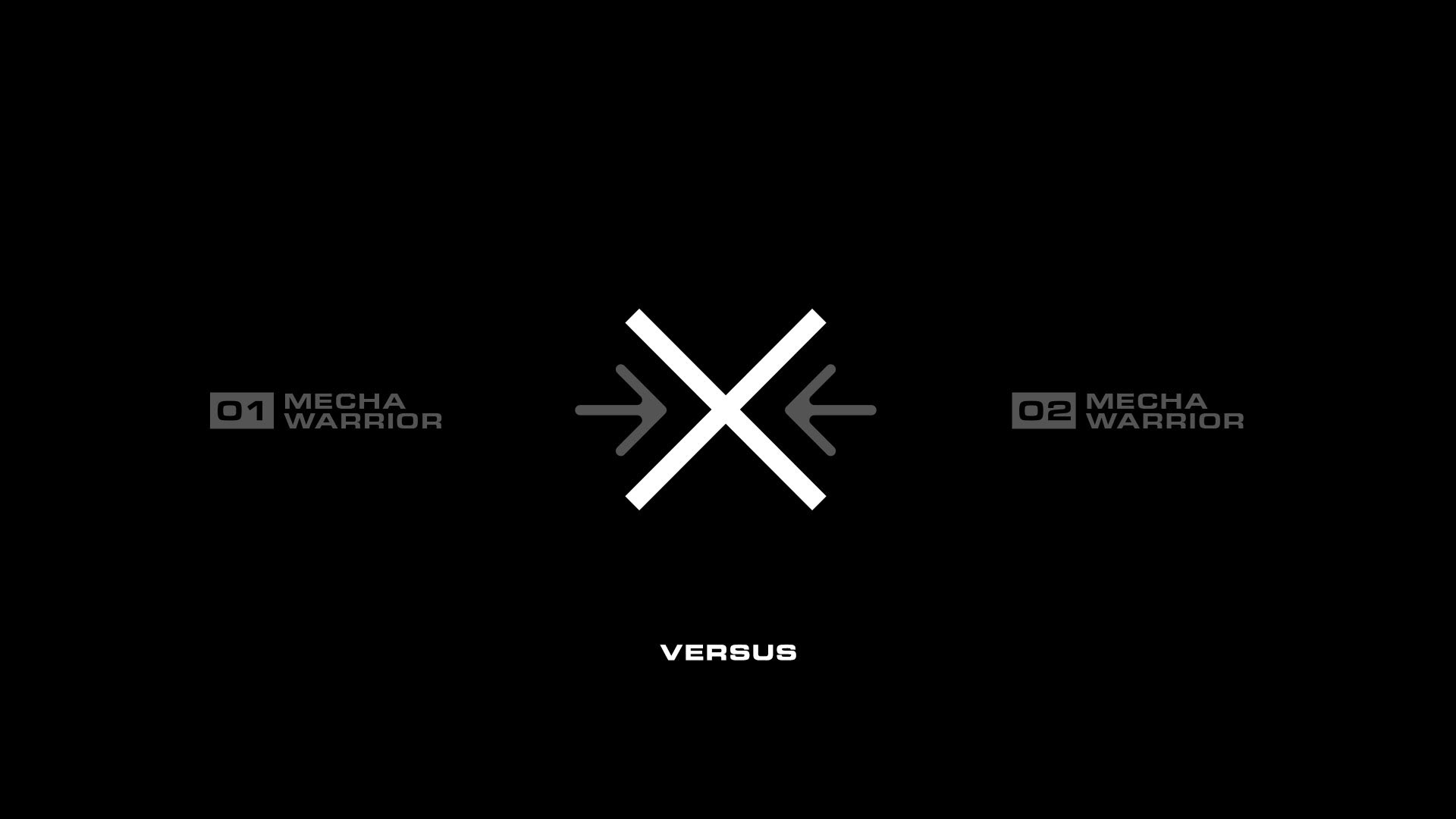
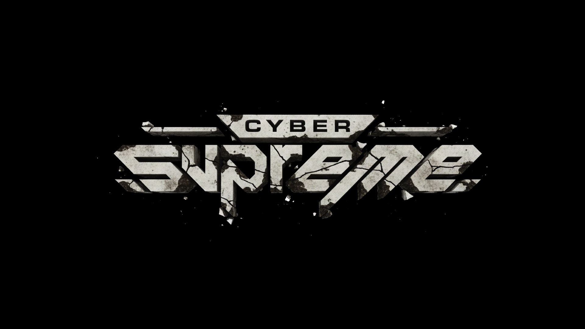
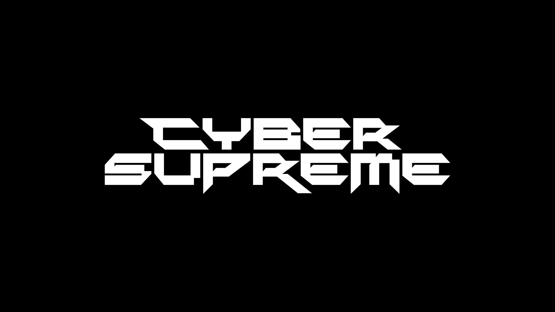
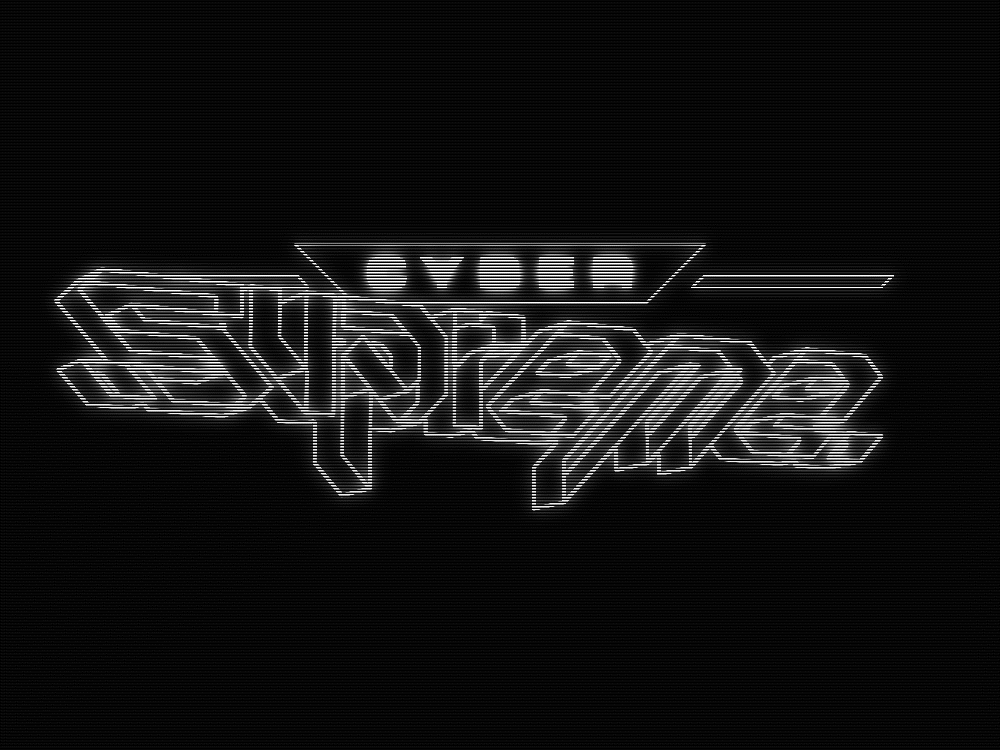
This concept comes from a single X that represents Warrior 1 versus Warrior 2
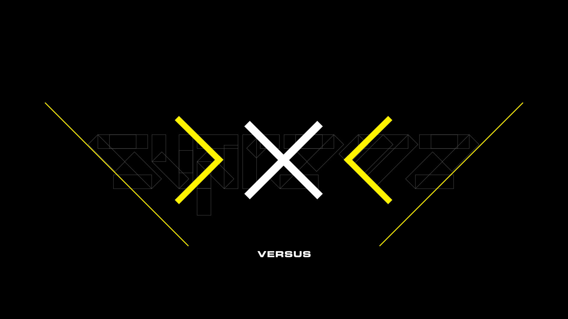
The aggressive angles of that X become the foundation for the thick, angular shapes in the mark,
setting up the symmetry and downward energy of the final logo.
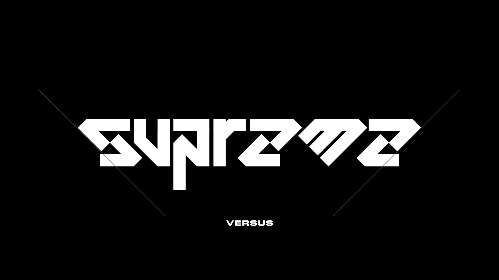
wordmark is built from mirrored blade-like forms that converge into a downward point,
symbolizing two opposing forces locked in combat.
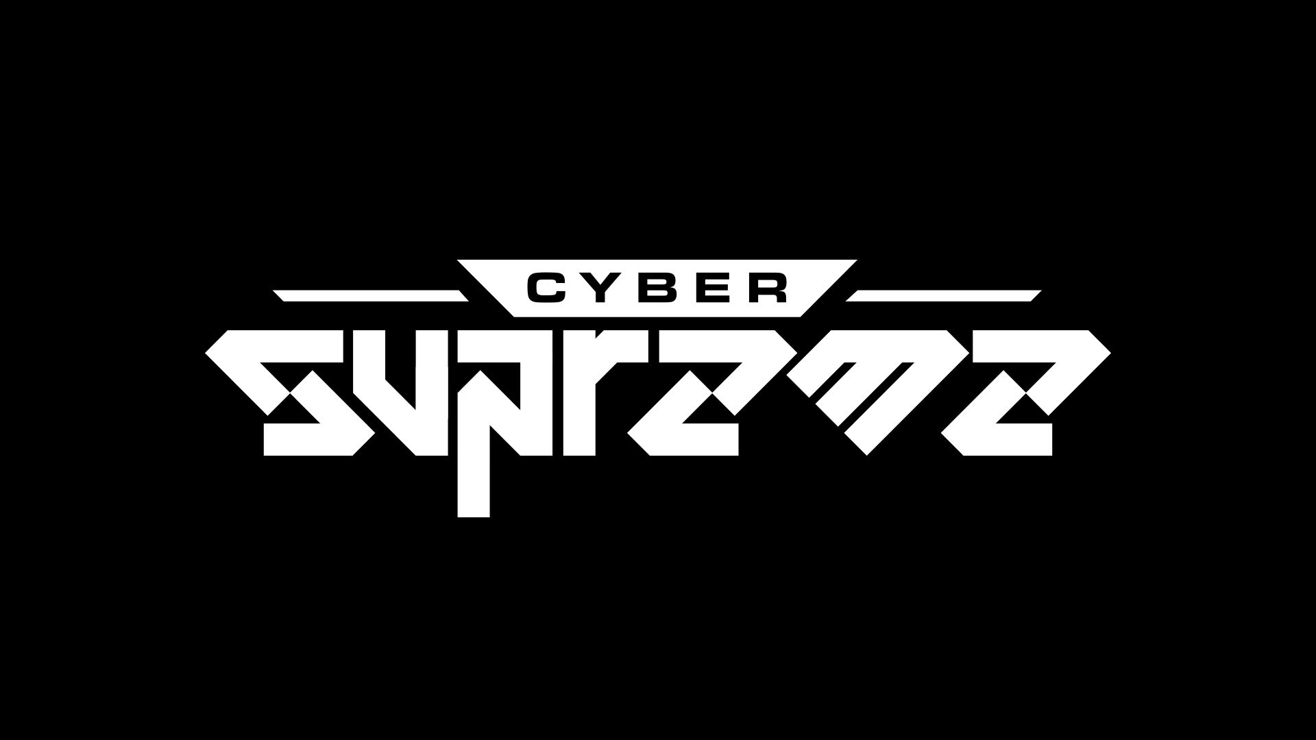
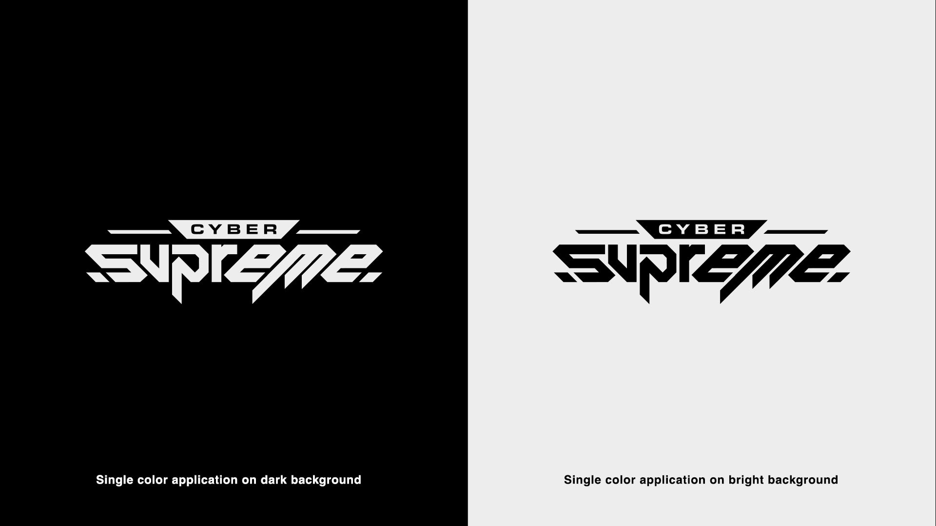
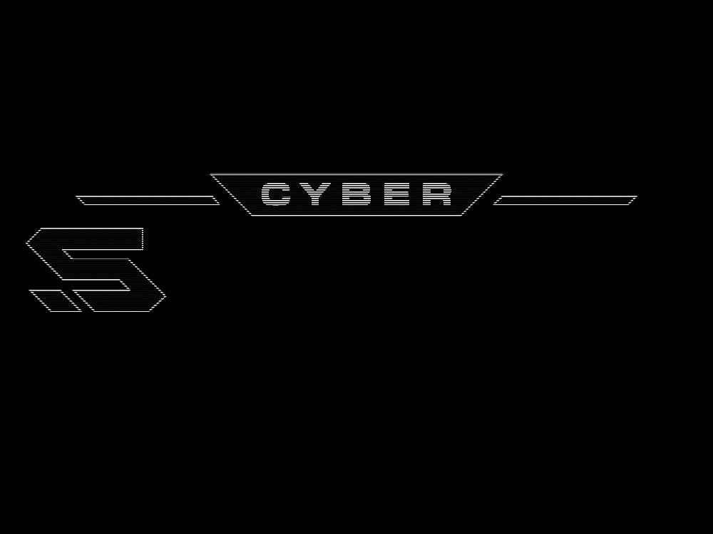
With the same angles in mind, a negative shape holds the word CYBER on top of SUPREME,
helping to achieve visual contrast even when the logo is presented in a single color.
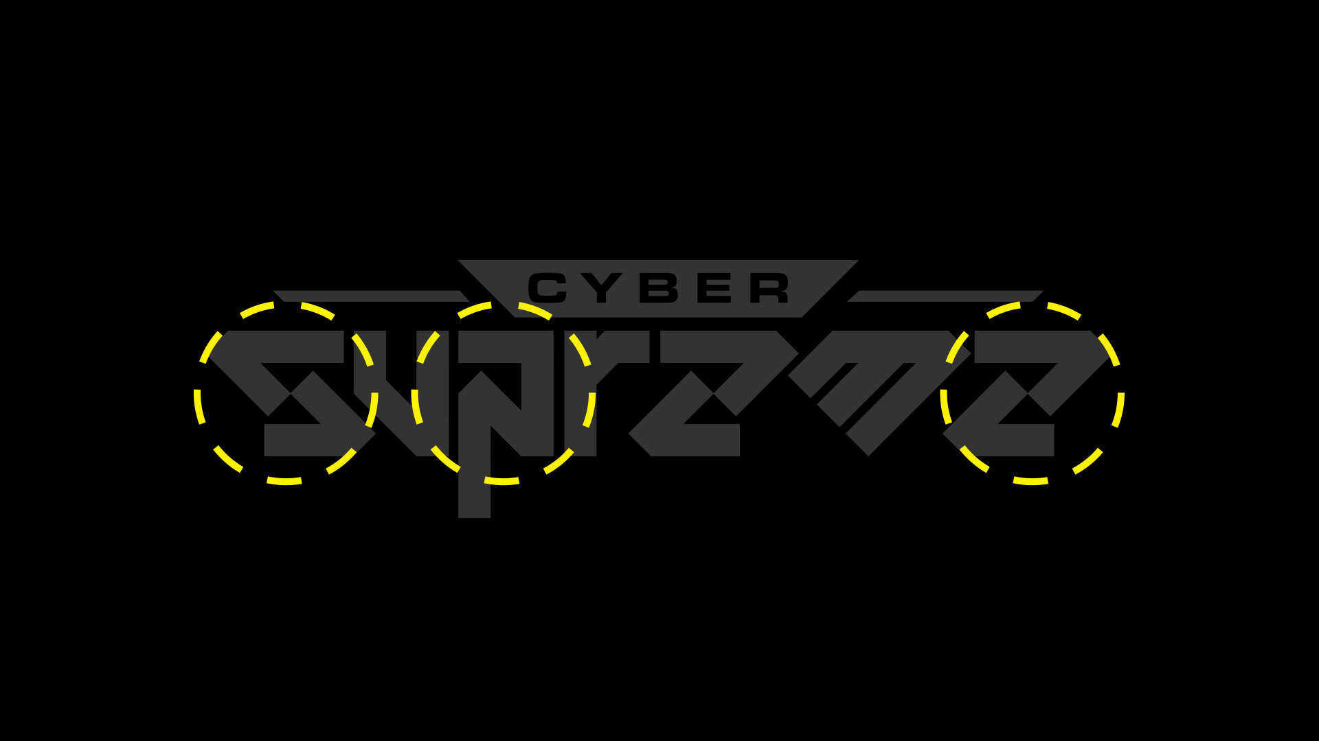
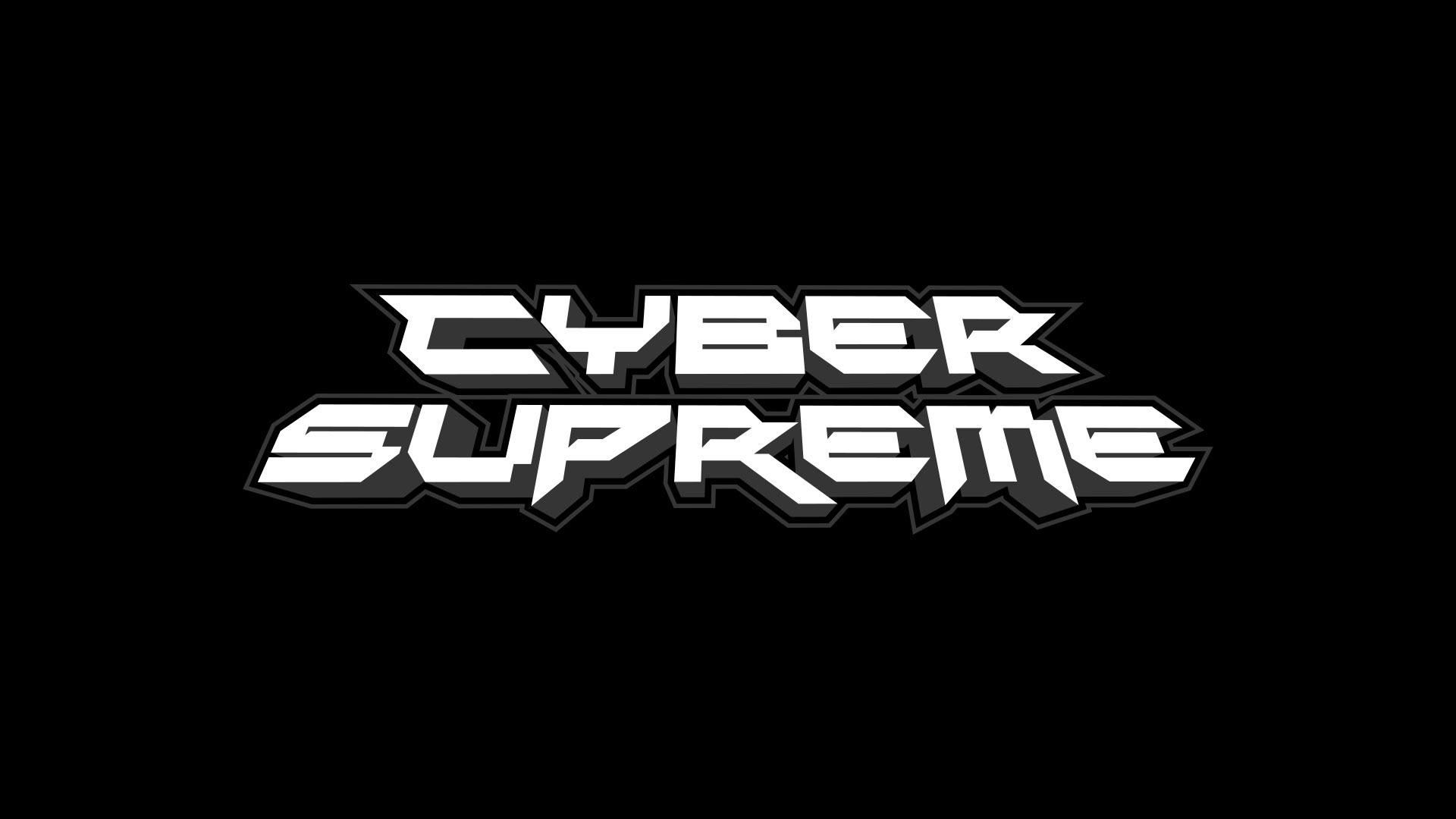
As much as I loved the futuristic shapes, one of the asks on this project was legibility, and I see how the S (Which mirrors as an E)
and the P could be problematic when presented to a wide audience.
Making an effort to keep the angular shapes, I was able to make these letters more legible
I still need to work on the final kerning and correct some of the angles so they are exact.
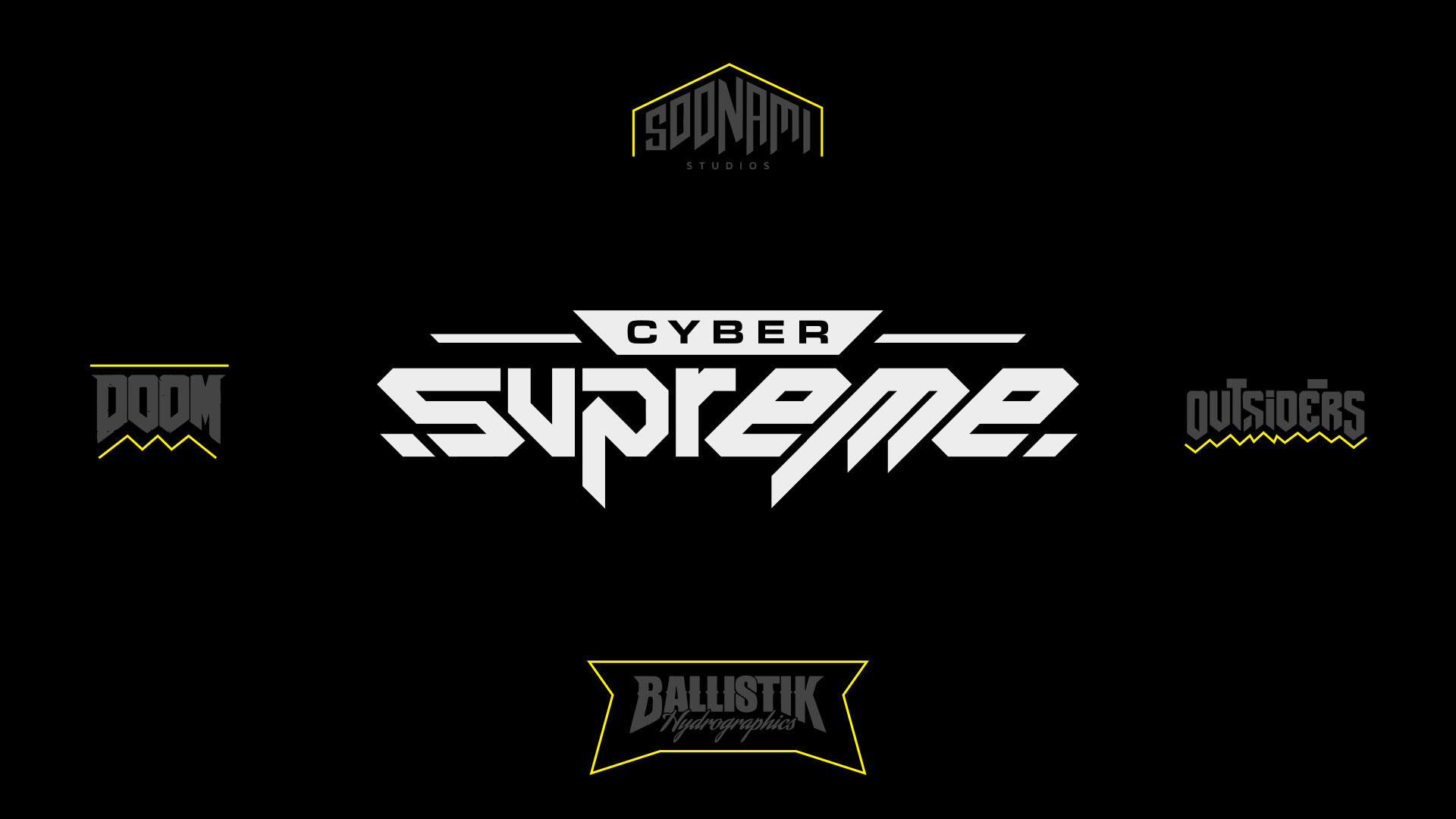
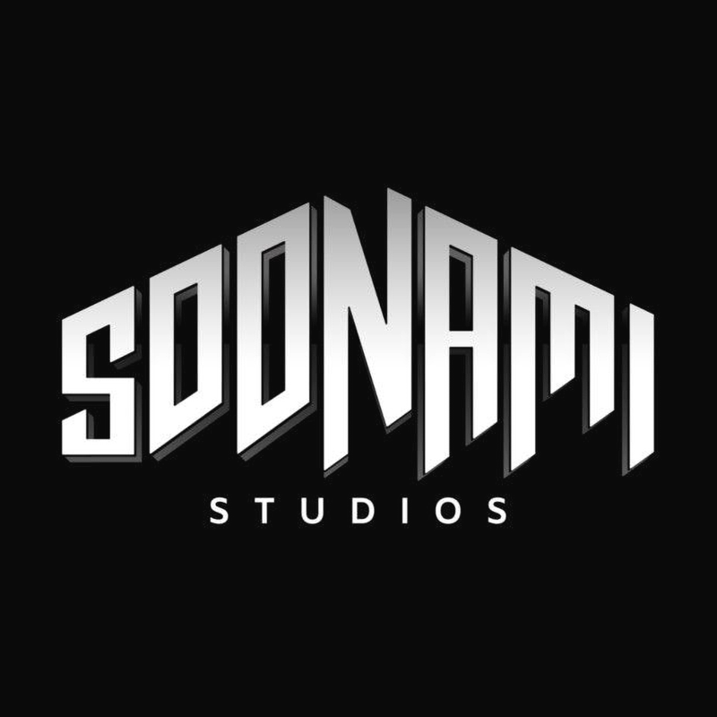
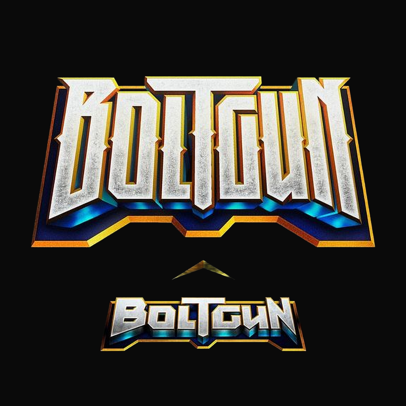
Direct references from selected logos, the arrow-like shape of Soonami, which points up, is inverted to convey power and strength.
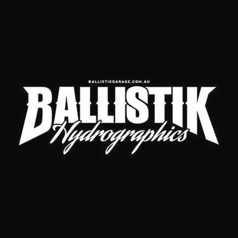
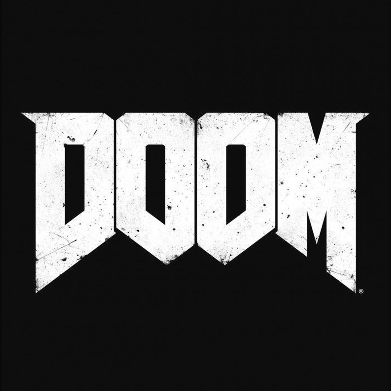
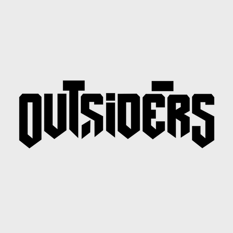
The serrated edges from Doom, the blade-like typography of Outsiders, and the overall form and dual word integration of Ballistik
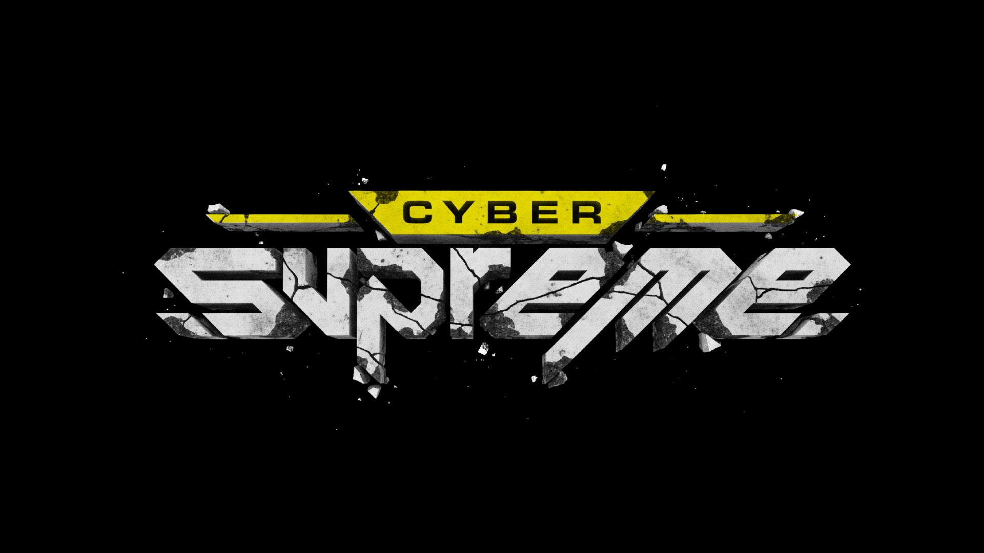
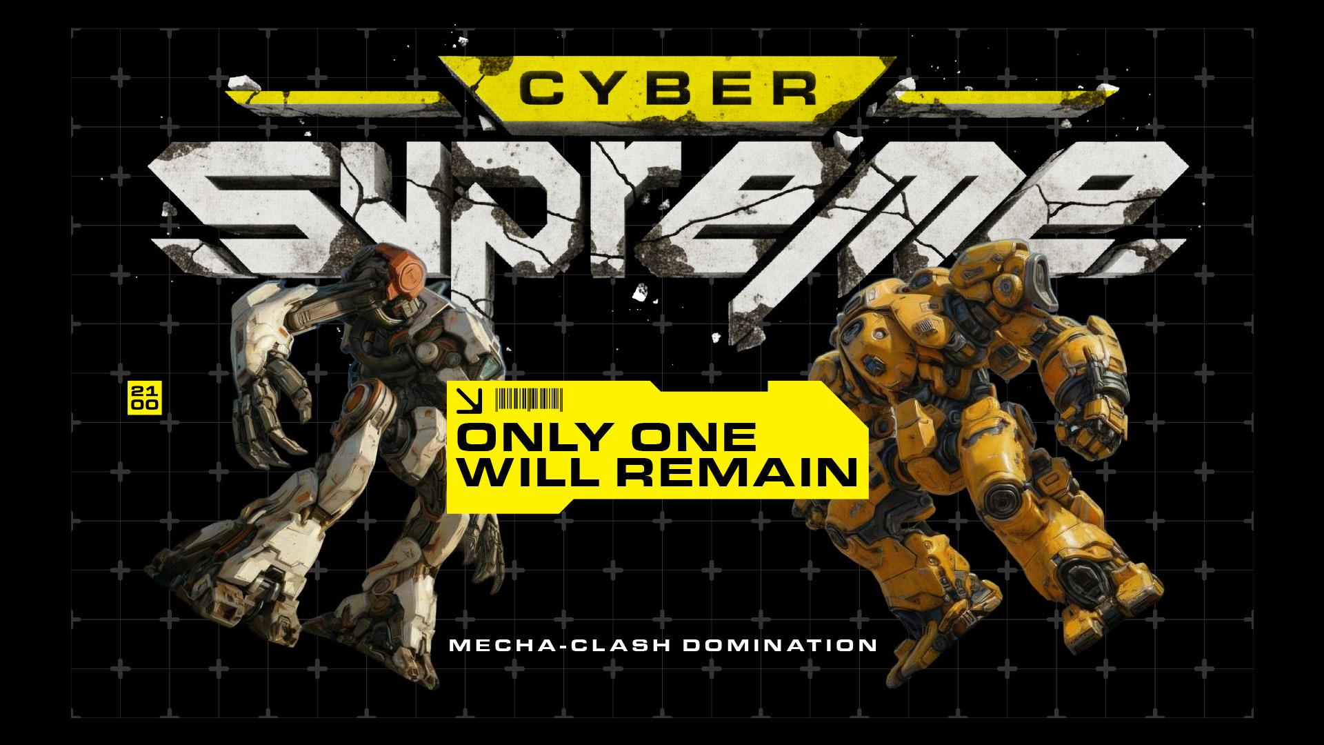
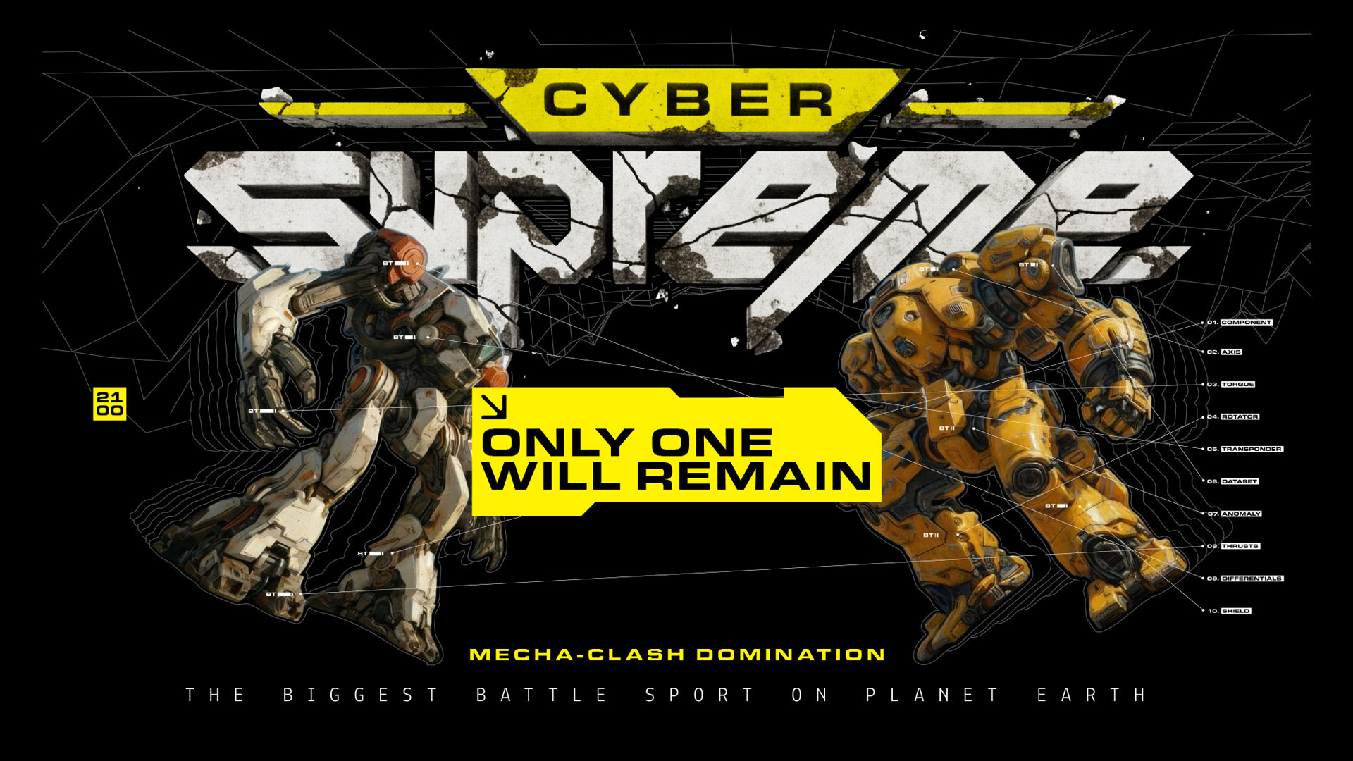
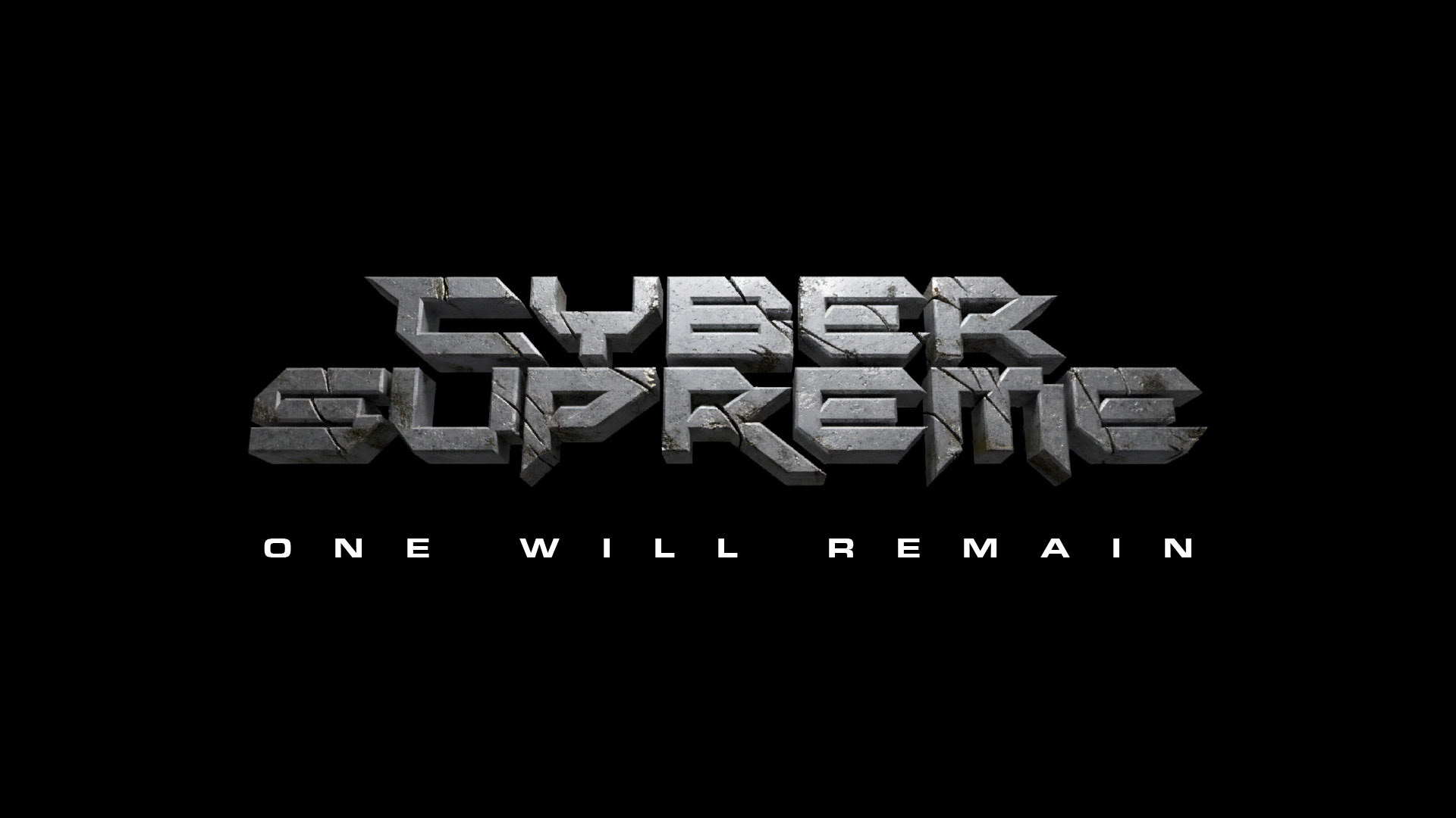
Here's what that logo could look like, in stone, eroded from battle, to double down on the feel of power