


Concept 01


Initial reactions:
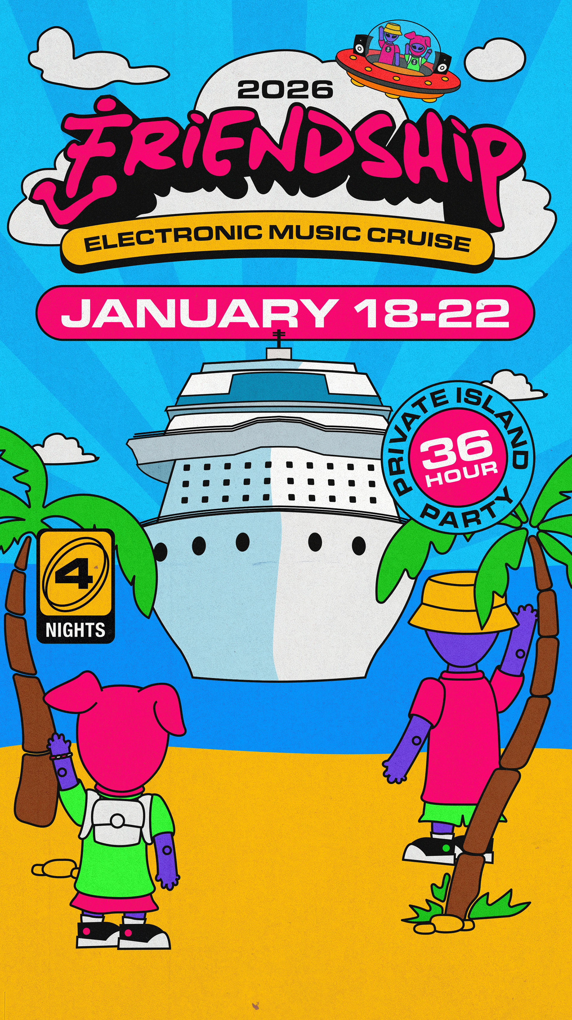
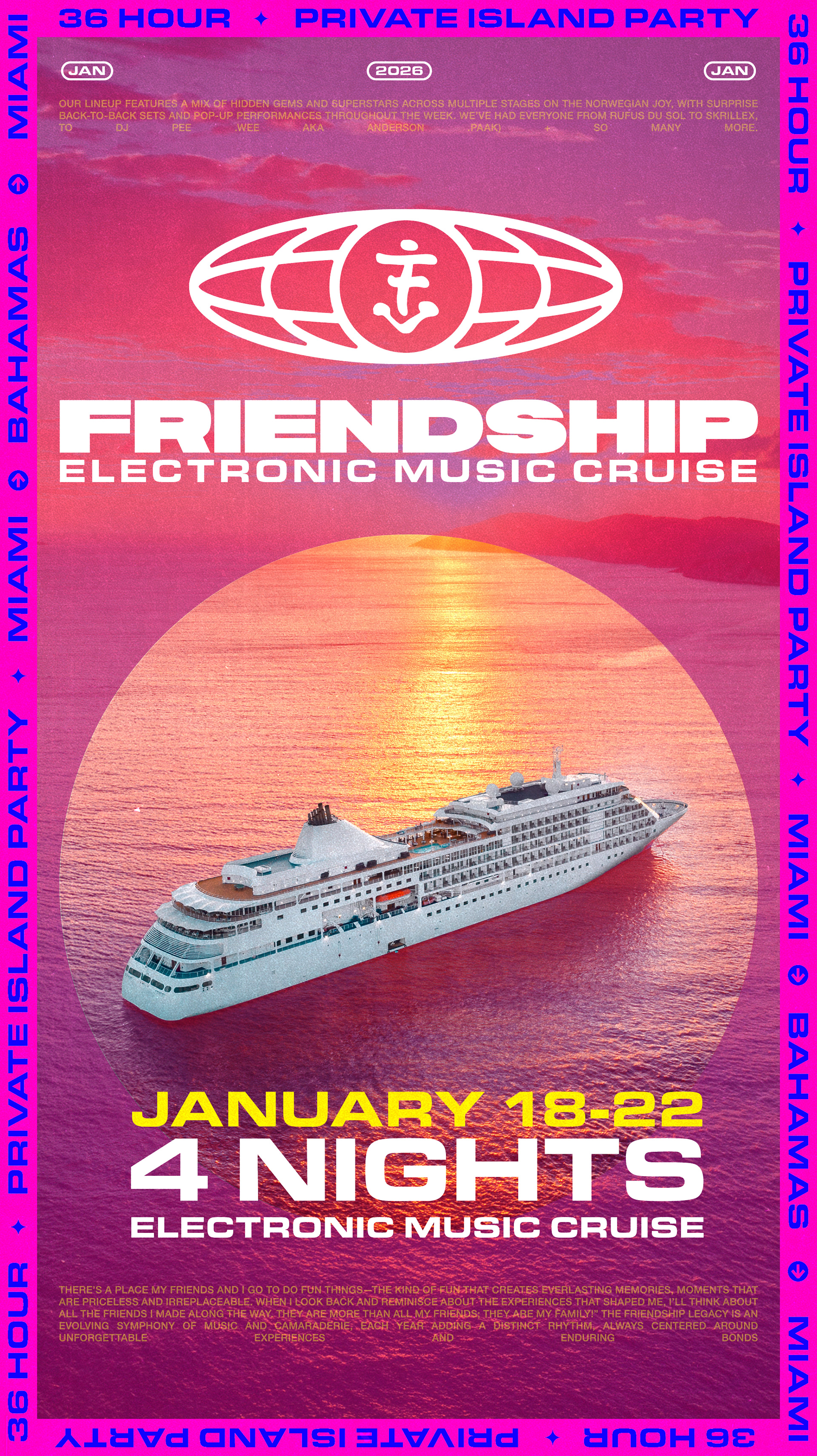
2026 in a classier font. / Client likes the overall direction. / Likes the futuristic badge concept.
Bright daylight scenes are preferred over dark ones.
2026 in a classier font. / Client likes the overall direction. / Likes the futuristic badge concept.
Bright daylight scenes are preferred over dark ones.

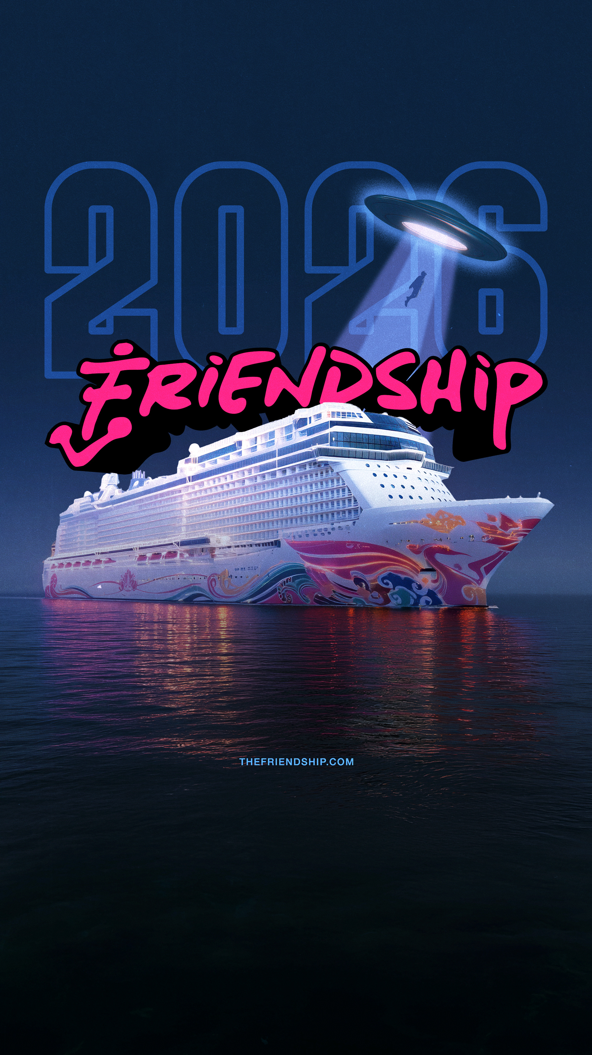
Minor tweaks to the Friendship mark, looking to balance the weight of the front "Anchor" by elongating the descender on the "P." Then added some low-angle perspective to elevate the mark and make it look more like a movie title.
This is just a suggestion, and we don't need to pursue it in this direction if you don't feel like it's improving on the existing mark.
Concept 02


Concept 03


Concept 04


Inspiration for Concept 05

01 - Clean / Typographic

02 - Y2k / Alien

03 - Future Rave

04 - Minimal details

05 - Travel Documents
Concept 05


Final Contenders

Option 01
Option 02

Option 03

Option 04

Option 05
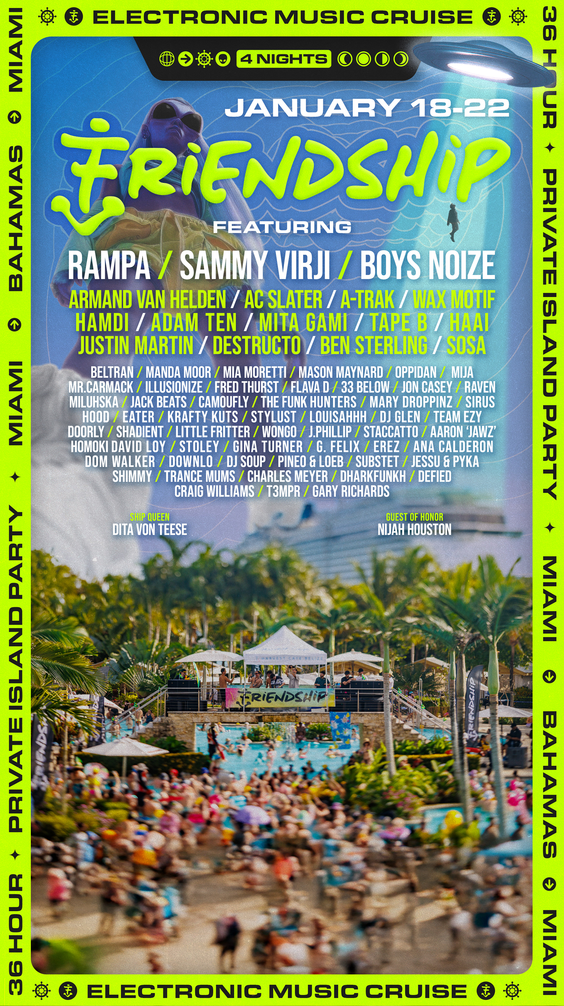
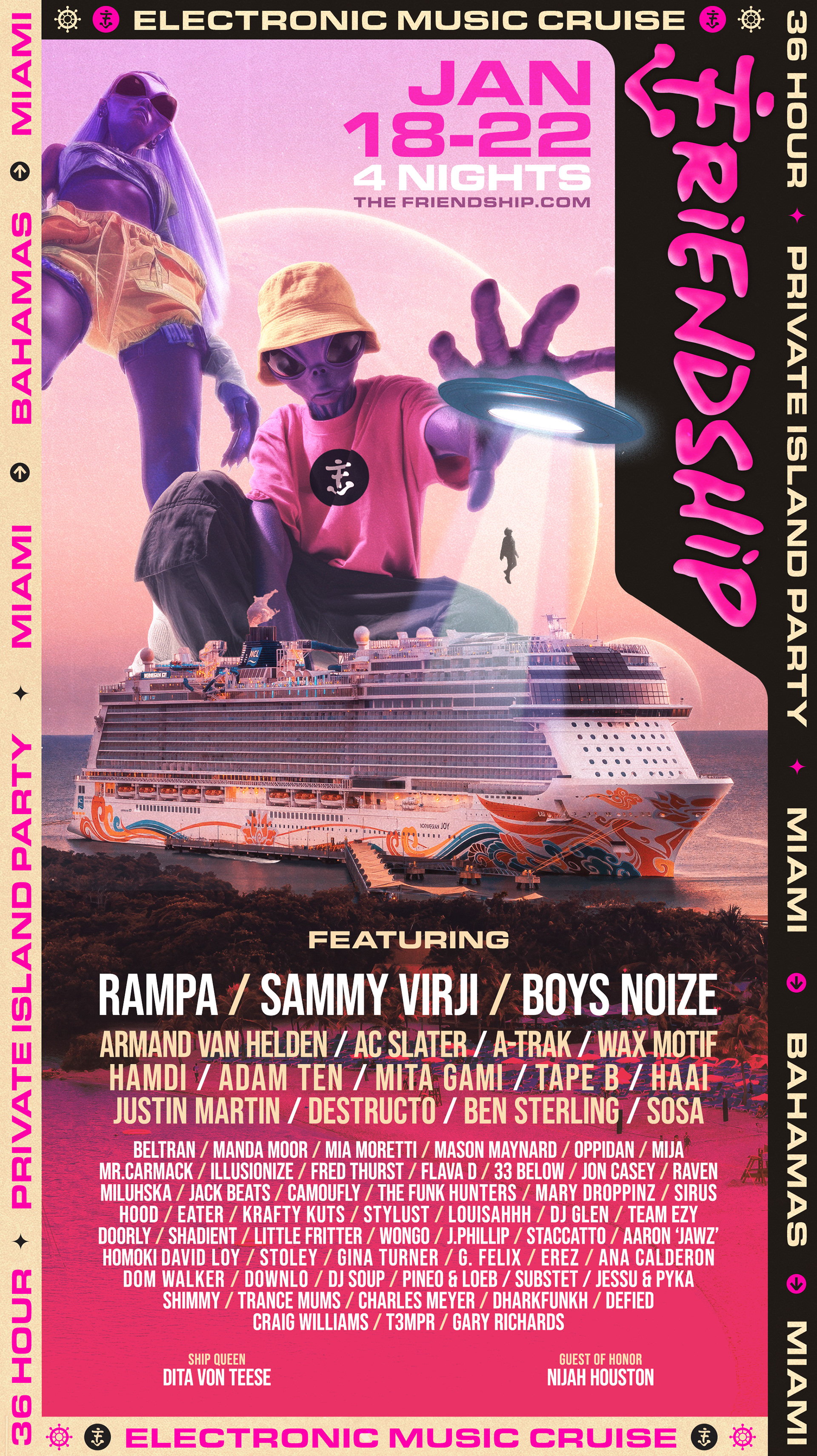
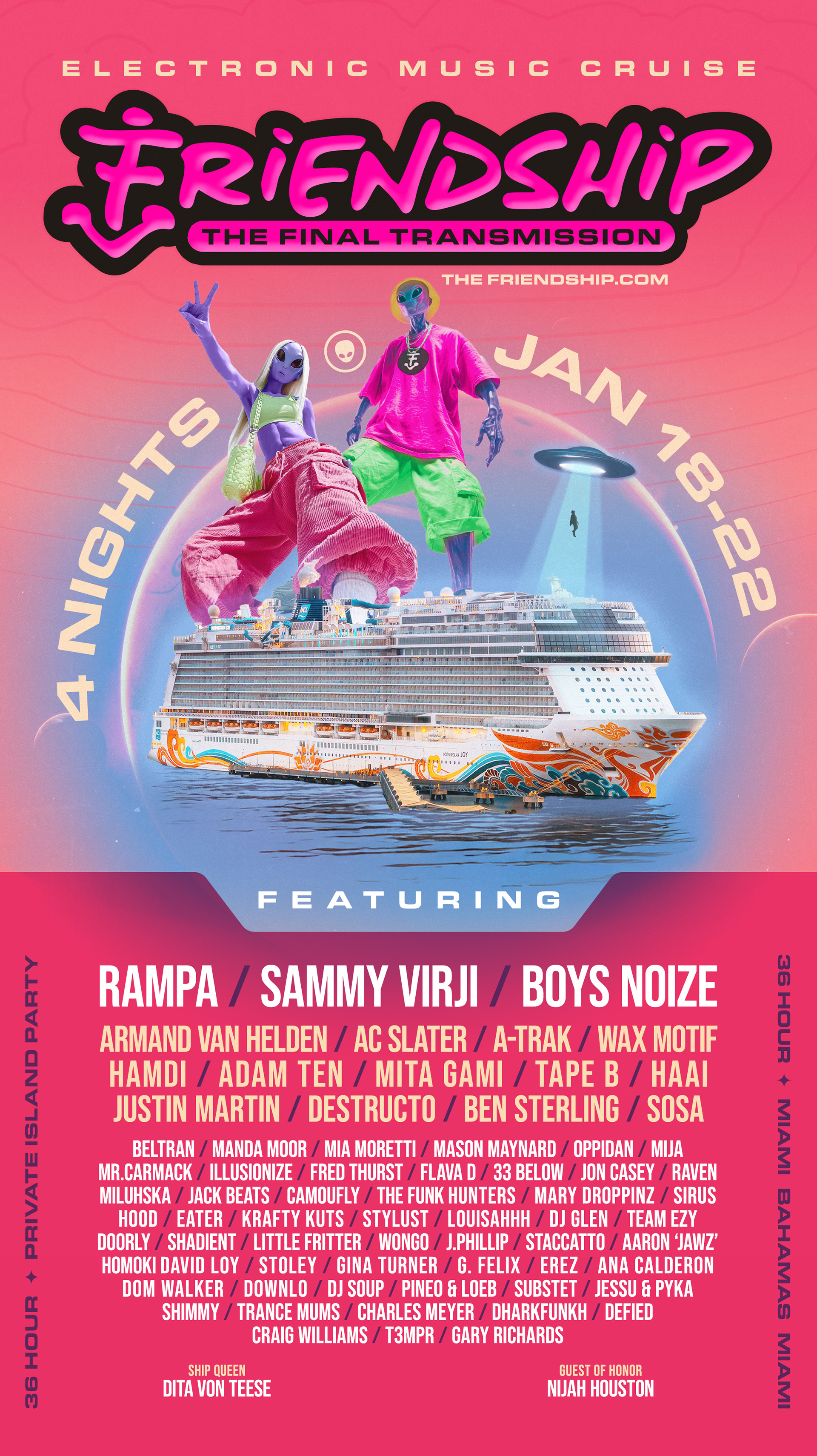
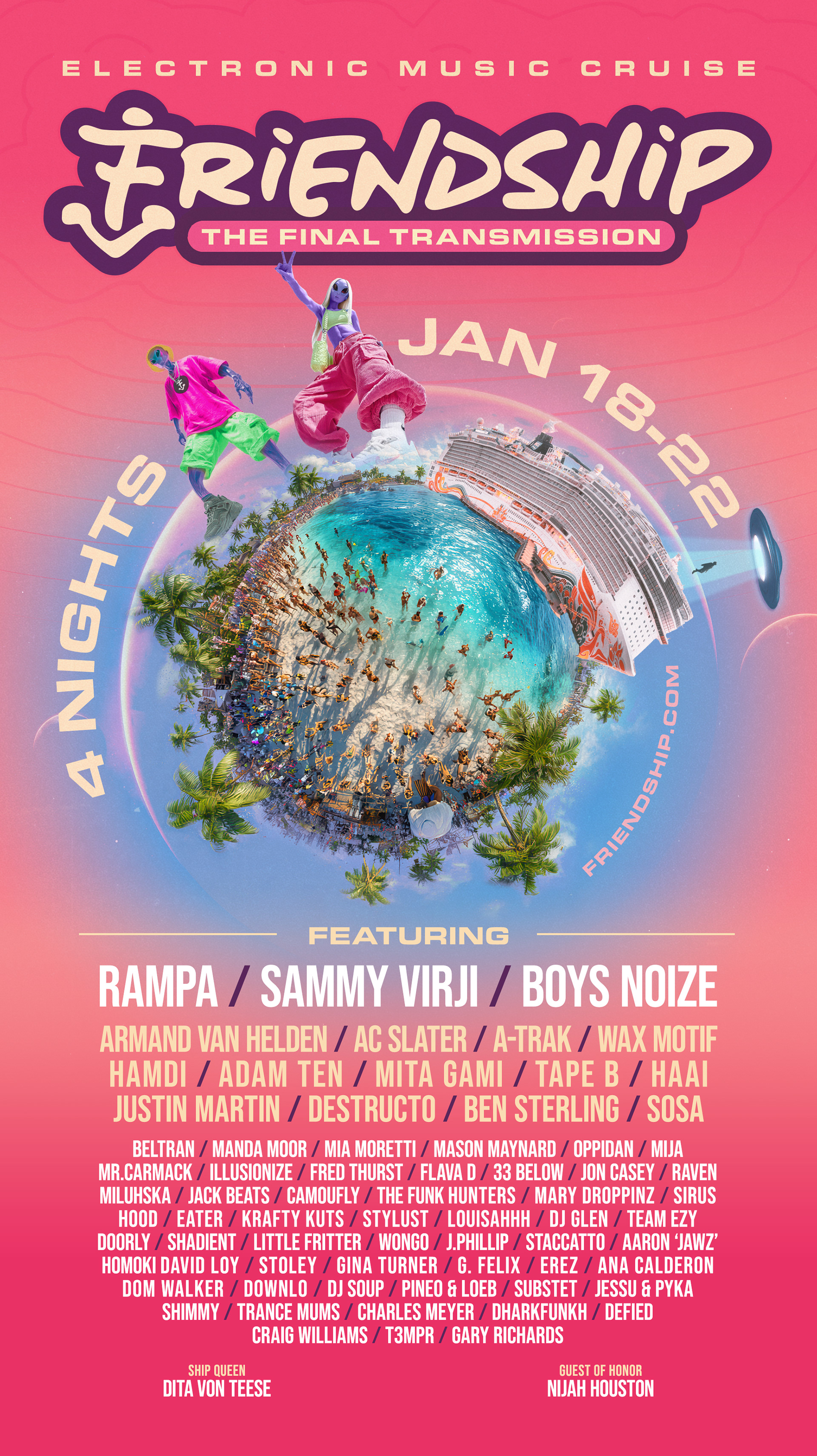
Selected Concept - Rev 01
Notes from meeting:
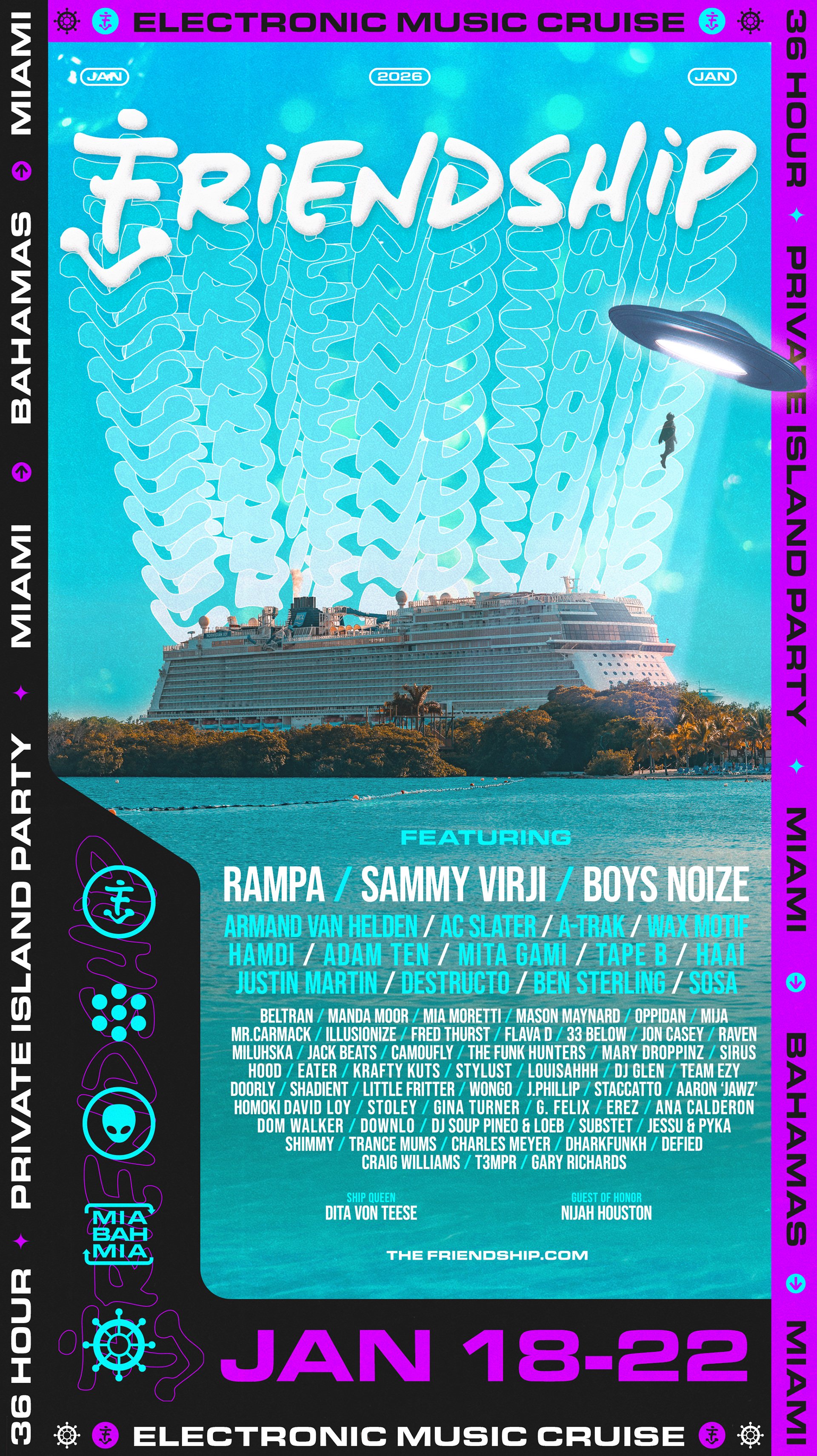
• A bit too busy at the moment
• Lose border/ simplify it
• Make graphic smaller to add space
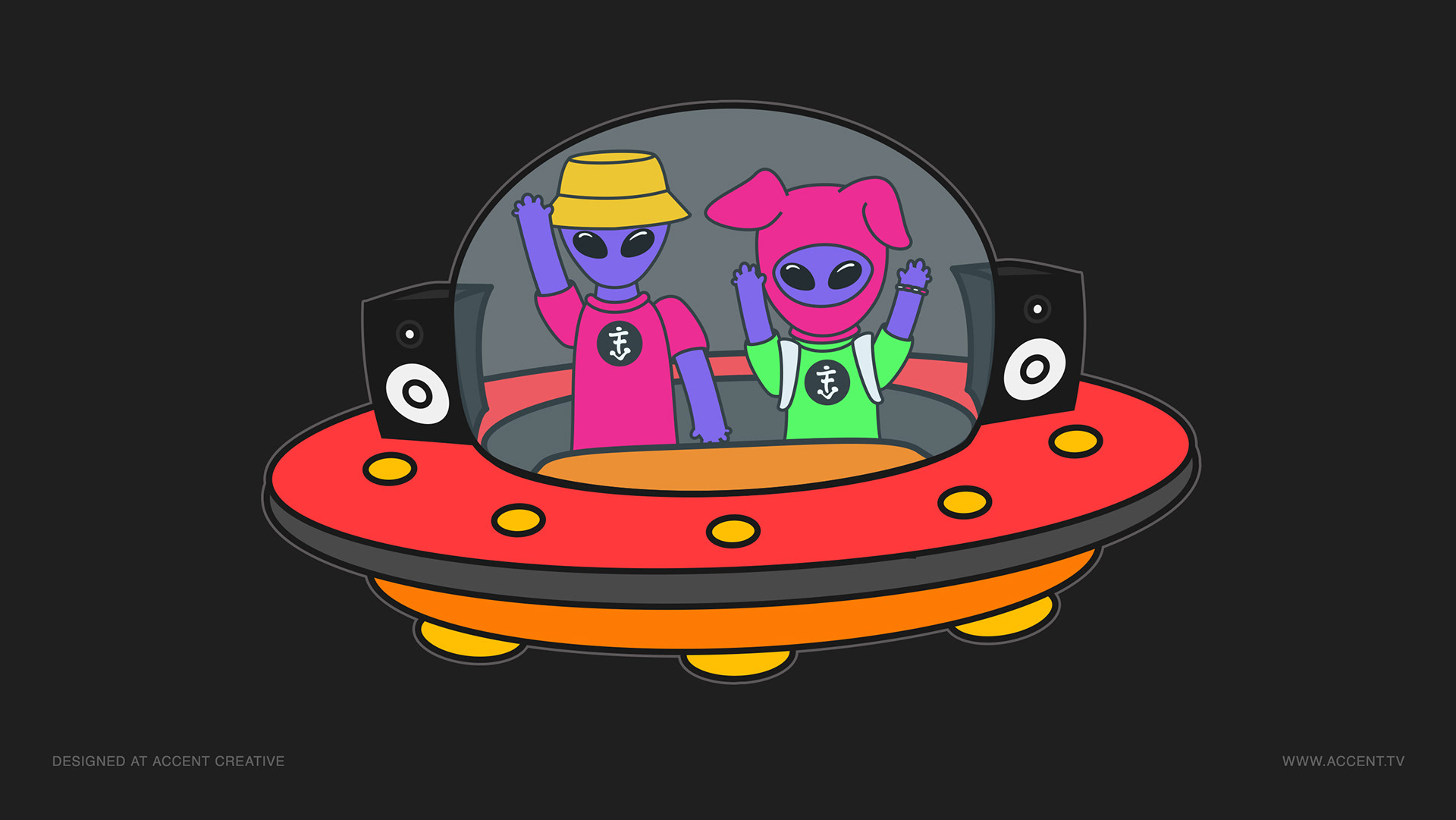
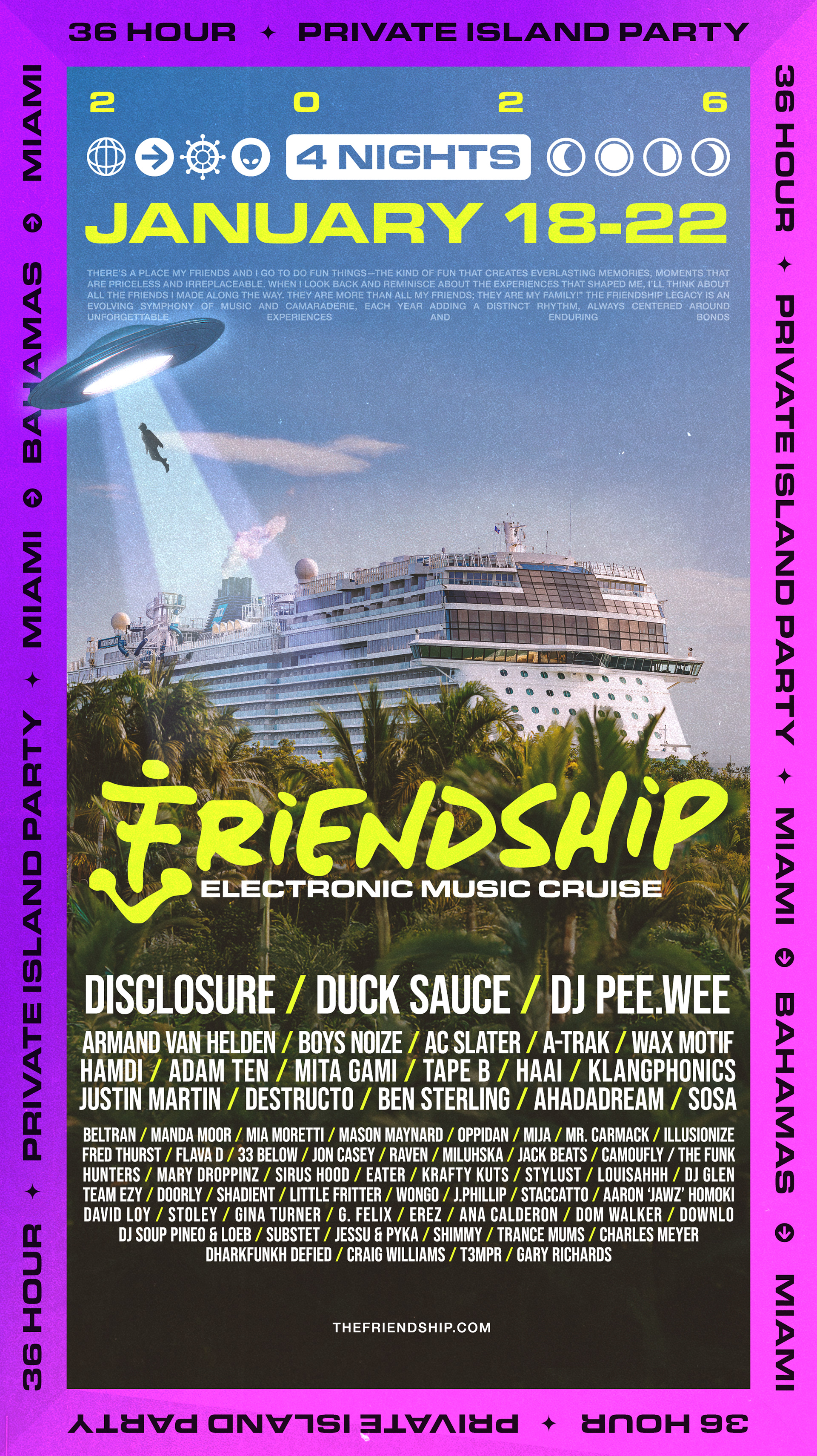
• Towering Aliens, Standing above ship
• Use “The Final Transmission” tag-line
• Horizontal version of Friendship Logo
• Lose border/ simplify it
• Make graphic smaller to add space
• Towering Aliens, Standing above ship
• Use “The Final Transmission” tag-line
• Horizontal version of Friendship Logo


Alien Design - Moodboard

